Why use Desmos’ default  and
and  axes when you can build your own? Check out this graph to get started.
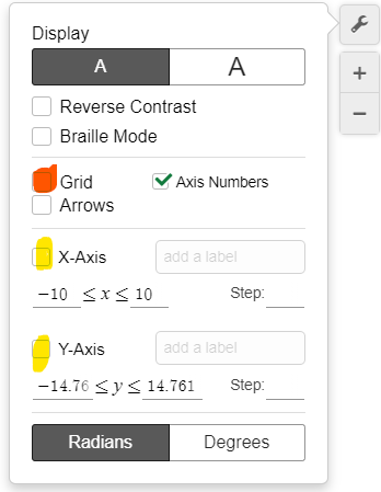
Step 1 – Remove Default Axes
Make sure to uncheck the default and axes. You should have a blank graph if you also uncheck the grid.
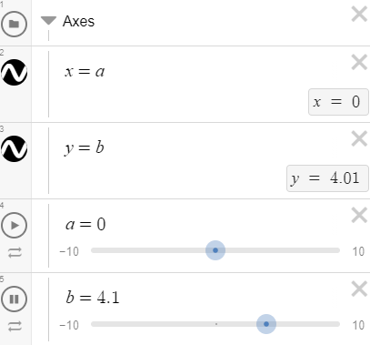
Step 2 – Create New Axes
Add a horizontal line for the -axis and a vertical line for the -axis. Setting them equal to sliders will allow you to move the axes if needed.
Step 3 – Add Some Ticks & Labels
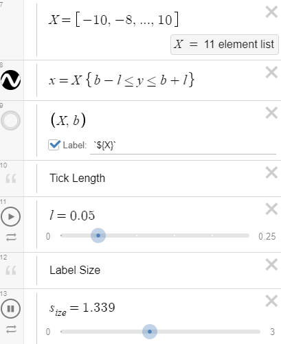
You can create a list in Desmos by using square brackets. In our example, we started at -10 and went in increments of 2 until we reached 10.
In line 8 of the graph, we actually draw the ticks by restricting the height of the vertical lines.
We can adjust the size of our axis labels by creating a slider.
Congratulations!!! You have created dynamic axes in Desmos!
Step 4 – Share the Wealth
Make sure to share your discoveries with the world. Someone somewhere will almost surely benefit from it. You reading this sentence is proof of it!