Main Takeaways
- Simpler is most often better.
- More information is better than less information.
- Don’t assume your audience is stupid.
- Tables usually outperform graphics in reporting on small data sets of 20 numbers or less.
- Graphical excellence is nearly always multivariate.
- “Graphical excellence is that which gives the viewer the greatest number of ideas in the shortest time with the least ink in the smallest space.”
- The vast majority of graphs should be wider than tall.
- Time-series is the most common graphical design.
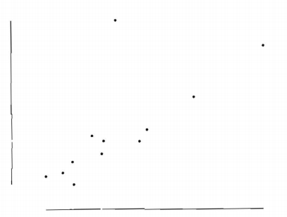
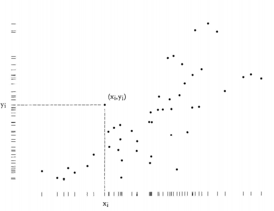
- The scatterplot and its variants (relational graphics) are the greatest of all graphical designs.
- Data is plural for datum. Datum = 1 data point.
Book Notes
PART I – GRAPHICAL PRACTICE
Chapter 1 – Graphical Excellence
- “Graphical displays should
- show the data
- induce the viewer to think about the substance rather than about methodology, graphic design, the technology of graphic production, or something else
- avoid distorting what the data have to say
- present many numbers in a small space
- make large data sets coherent
- encourage the eye to compare different pieces of data
- reveal the data at several levels of detail, from a broad overview to the fine structure
- serve a reasonably clear purpose: description, exploration, tabulation, or decoration
- be closely integrated with the statistical and verbal descriptions of a data set.”
- “Graphical excellence is nearly always multivariate.”
- “Small, noncomparative, highly labelled data sets usually belong in tables.”
- Data-maps
- Pros:
- They can carry a large amount of data in a small space (high data density)
- They are intuitive. Our brain is used to maps.
- Computers have increased the density of information some 5000- fold.
- Cons:
- They wrongly equate the importance of a region with its size instead of population.
- Data-collection techniques may differ slightly based on local differences which may lead to bias.
- Pros:
- Time-Series
- Most frequently used form of graphic design.
- “Time-series displays are at their best for big data sets with real variability. Why waste the power of data graphics on simple linear changes, which can usually be better summarized in one or two numbers?”
- Pros:
- “The natural ordering of the time scale gives this design a strength and efficiency of interpretation found in no other graphic arrangement.”
- Multiple time-series displays can encourage comparative multivariate analysis.
- The before-after time-series is powerful if given appropriate data.
- Cons:
- “The problem with time-series is that the simple passage of time is not a good explanatory variable: descriptive chronology is not causal explanation.”
- There are exceptions. It can happen that time itself is the causal mechanism.
- “Time-series plots can be moved towards causal explanation by smuggling additional variables into the graphic design.”
- “The problem with time-series is that the simple passage of time is not a good explanatory variable: descriptive chronology is not causal explanation.”
- Narrative Graphics of Space and Time
- Small-Multiples Displays with time as the index variable.
- They are economical.
- Once the viewers understand the design of one slice, they have immediate access to data in all other slices.
- Small-Multiples Displays with time as the index variable.
- More Abstract Designs: Relational Graphics
- The x and y-axes of a graph were almost always latitude and longitude.
- Replacing them with abstract concepts was a big step.
- “Graphical design was at last no longer dependent on direct analogy to the physical world.”
- “This meant, quite simply but quite profoundly, that any variable quantity could be placed in relationship to any other variable quantity, measure for the same units of observation.”
- About 40% of graphics in the modern scientific literature have relational form.
- “The relational graphic – in its barest form, the scatterplot and its variants – is the greatest of all graphical designs.”
- Principles of Graphical Excellence
- Graphical excellence is the well-designed presentation of interesting data – a matter of substance, of statistics, and of design.
- Graphical excellence consists of complex ideas communicated with clarity, precision, and efficiency.
- Graphical excellence is that which gives the viewer the greatest number of ideas in the shortest time with the least ink in the smallest space.
- Graphical excellence is nearly always multivariate.
- And graphical excellence requires telling the truth about the data.


Chapter 2 – Graphical Integrity
- What is Distortion in a Data Graphic?
- Perceived visual effect Versus Physically measured surface of the graphic
- The perceived area of a circle probably grows somewhat more slowly than the actual area.

- Perceptions are context-dependent.
- Perceived visual effect Versus Physically measured surface of the graphic
- Two Principles of Graphical Integrity
- The representation of numbers, as physically measured on the surface of the graphic itself, should be directly proportional to the numerical quantities represented.

- Lie Factors greater than 1.05 or less than 0.95 indicate substantial distortion.
- In practice, almost all distortions involve overstating (
 ).
).
- Clear, detailed, and thorough labelling should be used to defeat graphical distortion and ambiguity. Write out explanations of the data on the graphic itself. Label important events in the data.
- The representation of numbers, as physically measured on the surface of the graphic itself, should be directly proportional to the numerical quantities represented.
- Tables usually outperform graphics in reporting on small data sets of 20 numbers or less.
- Design and Data Variation
- Avoid irregular scales.
- Avoid using taller than wide graphics to falsely represent rapid growth.
- The Principles:
- Show data variation, not design variation.
- In time-series displays of money, deflated and standardized units of monetary measurement are nearly always better than nominal units.
- Visual Area and Numerical Measure
- Avoid using two or three variables to show one-dimensional data.
- The number of information-carrying (variable) dimensions depicted should not exceed the number of dimensions in the data.
- Context is Essential for Graphical Integrity
- “Compared to what?”
- The principle:
- Graphics must not quote data out of context.
Chapter 3 – Sources of Graphical Integrity and Sophistication
- Explanations for bad graphics
- Lack of quantitative skills of professional artists
- The doctrine that statistical data are boring
- The doctrine that graphics are only for the unsophisticated reader
- The Consequences
- Over-decorated and simplistic designs
- Tiny data sets
- Big lies
- There is evidence that twelve-year-old children understand the scatterplot.
- Less than 10% of the graphics found in the news are relational (links 2+ variables but is not a time-series or map)
- Some like the Wall Street Journal had 0% with 449 graphics in the sample.
- Graphical competence demands three quite different skills:
- The substantive
- The statistical
- The artistic
Allowing artist-illustrators to control the design and content of statistical graphics is almost like allowing typographers to control the content, style, and editing of prose.
Edward R. Tufte
PART II – THEORY OF DATA GRAPHICS
Chapter 4 – Data-Ink and Graphical Redesign
Above all else show the data.
The Fundemental Principle of Good Statistical graphics
- Data-Ink
- “Data-ink is the non-erasable core of a graphic, the non-redundant ink arranged in response to variation in the numbers represented.”

- Maximize the data-ink ratio, within reason.
- Two Erasing Principles
- Erase non-data-ink, within reason.
- Erase redundant data-ink, within reason.
- Revise and edit.
Chapter 5 – Chartjunk: Vibrations, Grids, and Ducks
- Avoid the Moiré Effects
- “Moiré vibration is an undisciplined ambiguity, with an elusive, eye-straining quality that contaminates the entire graphic. It has no place in data graphical design.”
- The Grid
- Dark grid lines are chartjunk.
- “When a graphic serves as a look-up table, then a grid may help in reading and interpolating. But even in this case, the grids should be muted relative to the data.”
- The Duck
- Modern architects abandoned ornaments and unconsciously designed buildings as ornaments.
- “It is all right to decorate construction but never construct decoration.”
- Modern architects abandoned ornaments and unconsciously designed buildings as ornaments.
Chapter 6 – Data-Ink Maximization and Graphical Design
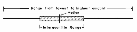
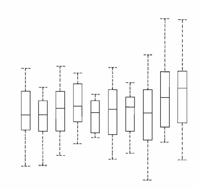
Redesign of the Box Plot

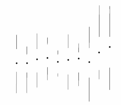
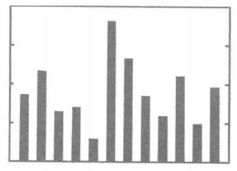
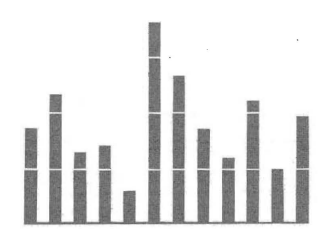
Redesign of the Bar Chart/Histogram
Redesign of the Scatterplot


- The range-frame applies to many types of graphics such as the time-series.
Dot-dash-plots make routine what good data analysts do already – plotting marginal and joint distributions together.
Edward R. Tufte
It is a frequent mistake in thinking about statistical graphics to underestimate the audience. Instead, why not assume that if you understand it, most other readers will too? Graphics should be as intelligent and sophisticated as the accompanying text.
Edward R. Tufte
Chapter 7 – Multifunctioning Graphical Elements
If we are going to make a mark, it may as well be a meaningful one. The simplest – and most useful – meaningful mark is a digit.
John Tukey
- The principle:
- Mobilize every graphical element, perhaps several times over, to show the data.
- Data-Built Data Measures
- Data Measure = The graphical element that actually locates or plots the data.
- The stem-and-leaf plot constructs the distribution of a variable with the numbers themselves.
- “The data-based grid is a shrewd graphical device, serving rather than fighting with the data. It is a technique underused in contemporary graphical work.”
- Avoid Puzzles and Hierarchy in graphics
- “Attempts to give colours an order result in those verbal decoders and the mumbling of little mental phrases required for graphical decoding.”
- Graphics can be designed to have at least three viewing depths:
- What is seen from a distance, an overall structure usually aggregated from an underlying microstructure
- What is seen up close and in detail, the fine structure of the data
- What is seen implicitly, underlying the graphic – that which is behind the graphic.
Seeing is forgetting the name of the thing one sees.
Paul Valéry
Chapter 8 – High-Resolution Data Graphics
![\[\mbox{data density of a display} = \frac{\mbox{number of entries in data matrix}}{\mbox{area of data display}}\]](https://duddhawork.com/wp-content/ql-cache/quicklatex.com-2bb7ed045d73972f7a4684a7c598f22c_l3.png "Rendered by QuickLaTeX.com")
Graphics can be shrunk way down.
Edward R. Tufte – The Shrink Principle
- Data Density in Graphical Practice
- Give the control of the information to the viewer instead of the editor.
- Data-thin displays move viewers toward ignorance and passivity.
- “Perhaps someday statistical graphics will perform as successfully as maps in carrying information.”
- Give the control of the information to the viewer instead of the editor.
- High Information Graphics
- More information > Less information
- Especially true when the marginal cost of new information is small (often the case)
- “The simple things belong in tables or text.”
- Overcrowded? Use data-reduction techniques
- averaging, clustering, smoothing
- “As the quantity of data increases, data measure must shrink (smaller dots for scatters, thinner lines for busy time-series).”
- More information > Less information
- The Principle
- Maximize data density and the size of the data matrix, within reason (but at the same time exploiting the maximum resolution of the available data-display technology).
- The Shrink Principle
- “Graphics can be shrunk way down.”
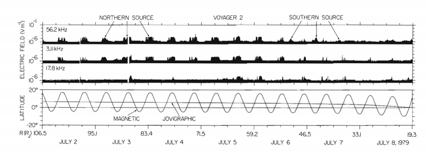
- Small Multiples
- “Small multiples are inherently multivariate, like nearly all interesting problems and solutions in data analysis.”
- Good small multiples charts are comparative, multivariate, shrunken, high-density, efficient in interpretation, and often narrative in content.
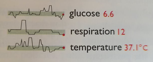
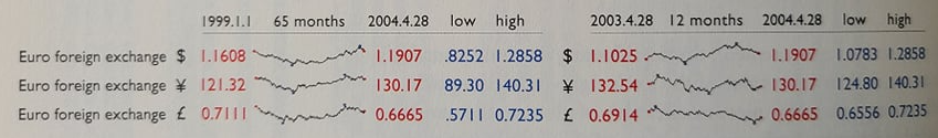
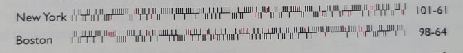
- Sparklines
- “Sparklines are datawords: data-intense, design-simple, word-sized graphics.
- Common applications include medical and financial data
- You can embed sparklines in tables.
- It is a good idea to colour-code the main points
- “The idea is to be approximately right rather than exactly wrong.” – John Tukey
- It is better to approximately answer the right question rather than exactly answer the wrong one.
- Sparklines can reduce recency bias by adding context to the data.
- “Tables sometimes reinforce recency bias by showing only current levels or recent changes; sparklines improve the attention span of tables.
- They efficiently display and narrate binary data.
- “For non-data-ink, less is more. For data-ink, less is bore.”
- How to create sparklines in R?
Chapter 9 – Aesthetics and Technique in Data Graphical Design
Graphical elegance is often found in simplicity of design and complexity of data.
Edward R. Tufte
- Good design has two key elements
- Simplicity of design
- Complexity of data
- Attractive displays of statistical information
- have a properly chosen format and design
- use words, numbers, and drawing together
- reflect a balance, a proportion, a sense of relevant scale, display an accessible complexity of detail
- often have a narrative quality, a story to tell about the data
- are drawn in a professional manner, with technical details of production done with care
- avoid content-free decoration, including chartjunk.
- The Choice of Design: Sentences, Text-Tables, Tables, Semi-Graphics, and Graphics
- “There are nearly always better sequences than alphabetical- for example, ordering by content or by data values.”
- “A table is nearly always better than a dumb pie chart.”
- “One supertable is far better than a hundred little bar charts.”
- Making Complexity Accessible: Combing Words, Number, and Pictures.
- Always write a text to explain your graphic.
- The data/text principle
- “Data graphics are paragraphs about data and should be treated as such.”
- “Tables and graphics should be run into the text whenever possible, avoiding the clumsy and diverting segregation of See Fig. 2 (figures all too often located on the back of the adjacent page).”
- You can show the figure in reduced size in later showings.
- Graphics and words were once well integrated in scientific manuscripts (Newton & da Vinci)
- The use of words will depend on the purpose of the design
- Exploratory Analysis ==> How to read
- Communication ==> What to read
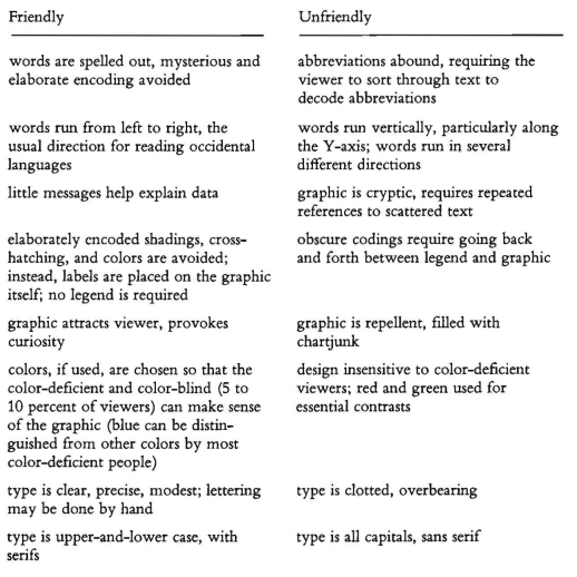
- Accessible Complexity: The Friendly Data Graphic
- serif writing is easier to read apparently.
- It is easier to read lower-case letters THAN IT IS TO READ UPPERCASE LETTERS.
- Proportion and Scale: Line Weight and Lettering
- “Lines in data graphics should be thin.”
- Proportion and Scale: The Shape of Graphics
- “Graphics should tend toward the horizontal, greater in length than height.”
- Our vision is rectangular (the horizon).
- Ease of labelling. There is more room to write from left to right if the graphic is horizontal
- Emphasis on causal influence. We can see more details from the causal variable on the x-axis.
- Tukey’s counsel.
- “Perhaps the most general guidance we can offer is that smoothly-changing curves can stand being taller than wide, but a wiggly curve needs to be wider than tall.”
- The Golden Rectangle
- Acceptable Range (based on psychology studies)
- The conclusions
- If the nature of the data suggests the shape of the graphic, follow that suggestion.
- Otherwise, move toward horizontal graphics about 50 percent wider than tall.
- “Graphics should tend toward the horizontal, greater in length than height.”


Data graphics are paragraphs about data and should be treated as such.
The Data/Text Principle – Edward R. Tufte

Affiliate Links
- The visual display of Quantitative Information – Edward R. Tufte