11 The Landscape of Modern Basketball
Note that all the R code used in this book is accessible on GitHub.
11.1 Motivation
In the previous chapter, we saw how we can group shots into clusters based on their local density (as shown in the left plot of Figure 11.1). In this chapter, we will attempt to quantify and visualize the local density at every spot on the half-court (as shown in the right plot of Figure 11.1). This approach should hopefully create a more informative depiction of where the shots are coming from. Furthermore, we will see how we can use these density estimates to identify the best spots to shoot from, to generate artificial shot locations, and to visualize the basketball court as a mountain range.
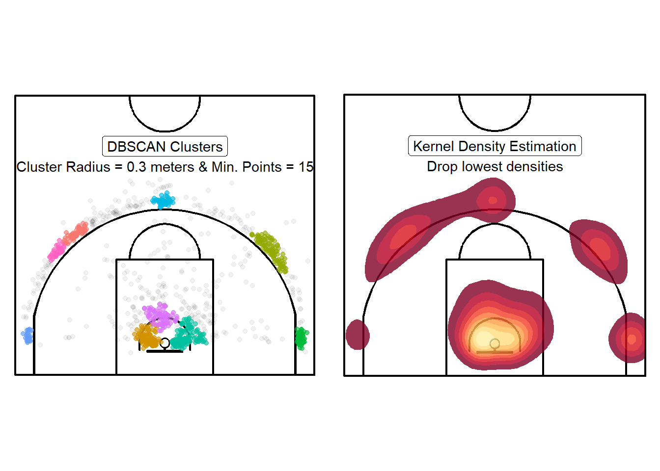
Figure 11.1: Moving away from Yes/No to something more nuanced
Let's load a larger dataset before we start our density estimation.
# Load the larger dataset
shots_3000_tb <- readRDS(file = "data/shots_3000_tb.rds")

# Load large spatial shots data
shots_3000_sf <- readRDS(file = "data/shots_3000_sf.rds")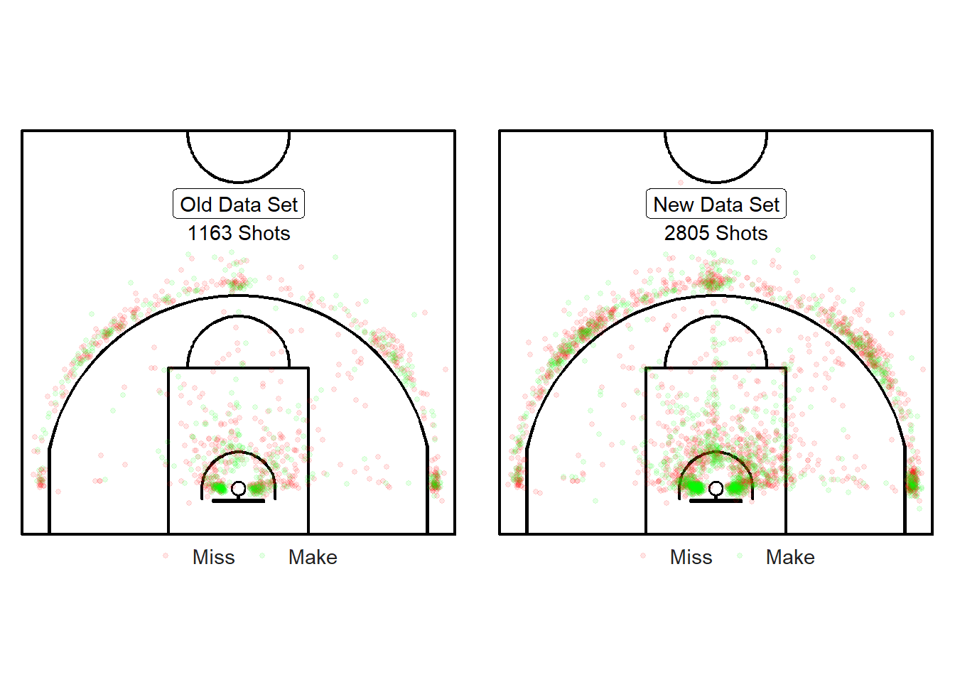
Figure 11.2: Yay! We have more shots.
We now have 2805 shots instead of 1163 shots. Note from Figure 11.2 that the new shots have roughly the same spatial structure of the previous dataset. The main difference is that the mid-range has more observations in the larger dataset which will make our density estimation and interpolation more relevant.
11.2 2D-Histograms & Spatial Binning
The simplest way to estimate the local density of a point-pattern is to split up the court into a grid and count the number of shots within each cell. However, histograms tend to be highly sensitive to the subjective placement of the grid75.
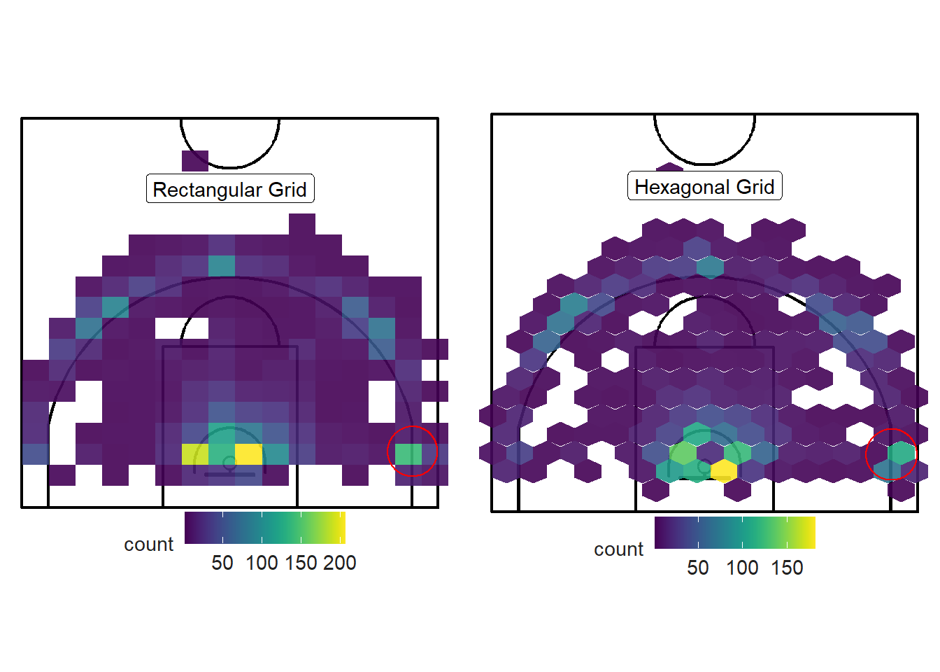
Figure 11.3: Which grid is best?
The cell size and location can lead to misleading results given the nature of basketball data. The rectangular cells that contain the three-point line are at a greater risk of misleading the reader. As you can see from Figure 11.4 below, some cells indicate a high density of shots inside the three-point line although there are little to no shots in this area. The vast majority of shots reside within one foot outside of the three-point line.
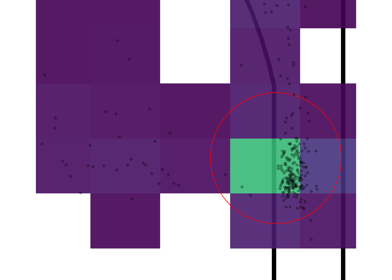
Figure 11.4: Close up look at the left corner-three area
11.3 Kernel Density Estimation
11.3.1 How It Works (ish) - 1D
The traditional way to get around this issue is to stop counting. The goal of this chapter is to move away from discrete values offered by clustering and spatial binning. Instead, we want to display the density of shots as a continuous quantity.
We can use Kernel Density Estimation (KDE) to achieve this. A kernel is a continuous function that is centered at each point in our data. The widget below76 comes from Eduardo García Portugués's notes that can be found here. It shows how the kernels are centered at the 10 randomly generated data points by default.The black curve is obtained by adding the heights of the kernels at a specific \(x\) value.
Figure 11.5: Thank you Eduardo for this application!
As the number of observations in the sample increase, the choice of kernel will have less of an impact than the choice of the bandwidth parameter. You can test the previous statements by generating 200 observations from the widget above and testing different combinations of bandwidths and kernels. Also note that the height of each kernel is divided by number of observations. Try generating just 1 observation with a bandwidth value near 1.
Next, we can apply the concept of KDE to our data. Let's try to estimate the density of the distances from the center of the hoop. We know that most shots in our shot locations data set take place near the rim and around the three-point line.

Figure 11.6: One-dimensional density plot for shot distance
As expected, the greatest densities occur in the first 2 meters and past the the dashed line which represents the radius of the arc of the three-point line77.
But how can we interpret the numbers of the y-axis of a density plot?
The key is to understand the difference between probability and probability density.
Probability ranges between zero and one. It describes how likely an event is to occur. In Figure 11.6, the event of interest is whether a randomly selected shot from our sample is likely to take place at a specific distance from the hoop.
Probability Density is not limited to values between zero and one. The numbers in the y-axis are the probability per unit length on the x-axis.
The y-axis of Figure 11.6 represents the probability density function (pdf) for the kernel density estimation78. To convert the density values of the histogram into probabilities, we simply need to find the area of each bin. The area of a rectangle is given by \(A_{\mbox{rectangle}} = \mbox{base} \times \mbox{height}\). Thus, the area of a particular bin is obtained by multiplying the bin width of 0.2 meters by the density value (height) of the bin.
| bin_mid | bin_width | count | density | bin_area |
|---|---|---|---|---|
| 0.1 | 0.2 | 0 | 0.000 | 0.000 |
| 0.3 | 0.2 | 8 | 0.014 | 0.003 |
| 0.5 | 0.2 | 96 | 0.171 | 0.034 |
| 0.7 | 0.2 | 202 | 0.360 | 0.072 |
| 0.9 | 0.2 | 186 | 0.332 | 0.066 |
| 1.1 | 0.2 | 159 | 0.283 | 0.057 |
| 1.3 | 0.2 | 141 | 0.251 | 0.050 |
| 1.5 | 0.2 | 107 | 0.191 | 0.038 |
| 1.7 | 0.2 | 67 | 0.119 | 0.024 |
| 1.9 | 0.2 | 89 | 0.159 | 0.032 |
| 2.1 | 0.2 | 59 | 0.105 | 0.021 |
| 2.3 | 0.2 | 49 | 0.087 | 0.017 |
| 2.5 | 0.2 | 53 | 0.094 | 0.019 |
| 2.7 | 0.2 | 45 | 0.080 | 0.016 |
| 2.9 | 0.2 | 36 | 0.064 | 0.013 |
| 3.1 | 0.2 | 23 | 0.041 | 0.008 |
| 3.3 | 0.2 | 19 | 0.034 | 0.007 |
| 3.5 | 0.2 | 19 | 0.034 | 0.007 |
| 3.7 | 0.2 | 17 | 0.030 | 0.006 |
| 3.9 | 0.2 | 15 | 0.027 | 0.005 |
| 4.1 | 0.2 | 13 | 0.023 | 0.005 |
| 4.3 | 0.2 | 17 | 0.030 | 0.006 |
| 4.5 | 0.2 | 14 | 0.025 | 0.005 |
| 4.7 | 0.2 | 19 | 0.034 | 0.007 |
| 4.9 | 0.2 | 27 | 0.048 | 0.010 |
| 5.1 | 0.2 | 19 | 0.034 | 0.007 |
| 5.3 | 0.2 | 13 | 0.023 | 0.005 |
| 5.5 | 0.2 | 6 | 0.011 | 0.002 |
| 5.7 | 0.2 | 8 | 0.014 | 0.003 |
| 5.9 | 0.2 | 6 | 0.011 | 0.002 |
| 6.1 | 0.2 | 11 | 0.020 | 0.004 |
| 6.3 | 0.2 | 12 | 0.021 | 0.004 |
| 6.5 | 0.2 | 8 | 0.014 | 0.003 |
| 6.7 | 0.2 | 83 | 0.148 | 0.030 |
| 6.9 | 0.2 | 371 | 0.661 | 0.132 |
| 7.1 | 0.2 | 443 | 0.790 | 0.158 |
| 7.3 | 0.2 | 199 | 0.355 | 0.071 |
| 7.5 | 0.2 | 72 | 0.128 | 0.026 |
| 7.7 | 0.2 | 22 | 0.039 | 0.008 |
| 7.9 | 0.2 | 26 | 0.046 | 0.009 |
| 8.1 | 0.2 | 14 | 0.025 | 0.005 |
| 8.3 | 0.2 | 7 | 0.012 | 0.002 |
| 8.5 | 0.2 | 1 | 0.002 | 0.000 |
| 8.7 | 0.2 | 2 | 0.004 | 0.001 |
| 8.9 | 0.2 | 1 | 0.002 | 0.000 |
| 9.1 | 0.2 | 0 | 0.000 | 0.000 |
| 9.3 | 0.2 | 0 | 0.000 | 0.000 |
| 9.5 | 0.2 | 0 | 0.000 | 0.000 |
| 9.7 | 0.2 | 0 | 0.000 | 0.000 |
| 9.9 | 0.2 | 0 | 0.000 | 0.000 |
| 10.1 | 0.2 | 0 | 0.000 | 0.000 |
| 10.3 | 0.2 | 0 | 0.000 | 0.000 |
| 10.5 | 0.2 | 0 | 0.000 | 0.000 |
| 10.7 | 0.2 | 1 | 0.002 | 0.000 |
| 10.9 | 0.2 | 0 | 0.000 | 0.000 |
Table 11.1 above displays the area of each bin. Note that adding the areas of all 55 bins adds up to one. This is because probability density functions (PDFs) need to add to one if discrete (histogram) or integrate to one if continuous (density curve).
It is often easier to work with and conceptualize discrete distributions like the histogram. However, working with the continuous estimated density curve from Figure 11.6 can be more useful. We need integrals to calculate the area under a continuous function. Since the curve is the probability density function, we know that the area under the curve must equal to one.
What is the probability of a shot occurring past the three-point line in our sample?
To answer the question above using the histogram, we can simply add the areas of the bins with a mid-point greater than 6.75 meters. We get that the total area of the 21 bins past the three-point line is 41.32. Thus, we estimated using histograms that there was roughly 41.32% of the shots to took place further than 6.75 meters from the hoop. In fact, we know that 42.82%79 of the shots were released past the specified distance.
We can also use the continuous density curve to try to answer the same question. The probability of a shot occurring past the three-point line is given by the area under the curve of the "bump" at the dashed line. We could use the integral below to get the exact area under the curve.
\[ \mbox{AUC}_{\mbox{three-point range}} = \int_{6.75}^{\infty} f(x) dx \]
The problem is that we do not know equation for \(f(x)\)80. We can estimate the area under the curve for the specific region with the red triangle in Figure 11.7 below.
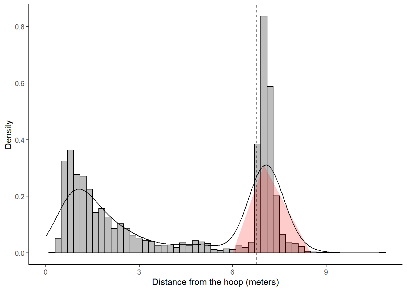
Figure 11.7: Estimating the area under the curve of a density plot
\[ A_{\mbox{triangle}} = \frac{\mbox{base} \times \mbox{height}}{2} = \frac{2.5 \times 0.3106951}{2} = 0.39 \]
The area of the triangle gives us the rough probability that a randomly selected shot in our sample occurred further than 6.75 meters from the hoop. It is important to realize that this method is not exact and was used only for demonstration purposes. Fancier methods could be used to better estimate the area under the curve of a density curve. Using interpolation to estimate \(f(x)\), we can use integration to get that the probability of a randomly selected shot in our sample is less than 3 meters away from the hoop to be 0.44, between 3 and 6 meters away is 0.1, and 6 meters or more to be 0.44. Adding these probabilities results in a number relatively close to one which makes sense since the total area under the curve should be 1.
Note that the "density bump" extends on the left of the dashed line for values less than 6.75 meters. This is because the default kernels are wide and leak over the dashed line even though the shots are are on the right. There are many techniques used to account for this "leakage" problem81. For our purpose we could simply adjust the banwidth to be half of its default value.
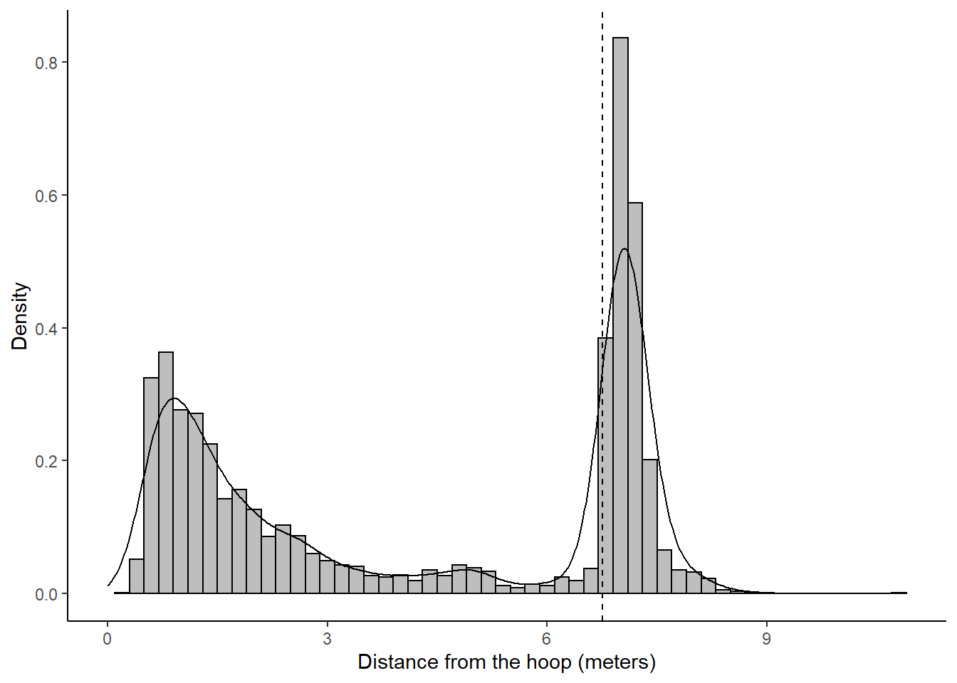
Figure 11.8: Smaller bandwidth to limit the leakage issue.
The three-point line "density bump" of Figure 11.8 has less of its area on the left of the dashed line than the bump of Figure 11.7. The adjust parameter of the geom_density() function was set to 0.5 to narrow the bandwidths of the kernels by half of their default values. This results in a better fit between the density curves and the density histogram.
Now that we understand how the one-dimensional Kernel Density Estimation works (ish), we can apply the technique on the basketball shot locations in our sample. Note that the density plots that follow were influenced by this post of the Mockup Blog.82
We can create a rug plot using the ggExtra package to plot the estimated marginal density distributions of our \((x, ~y)\) coordinates.
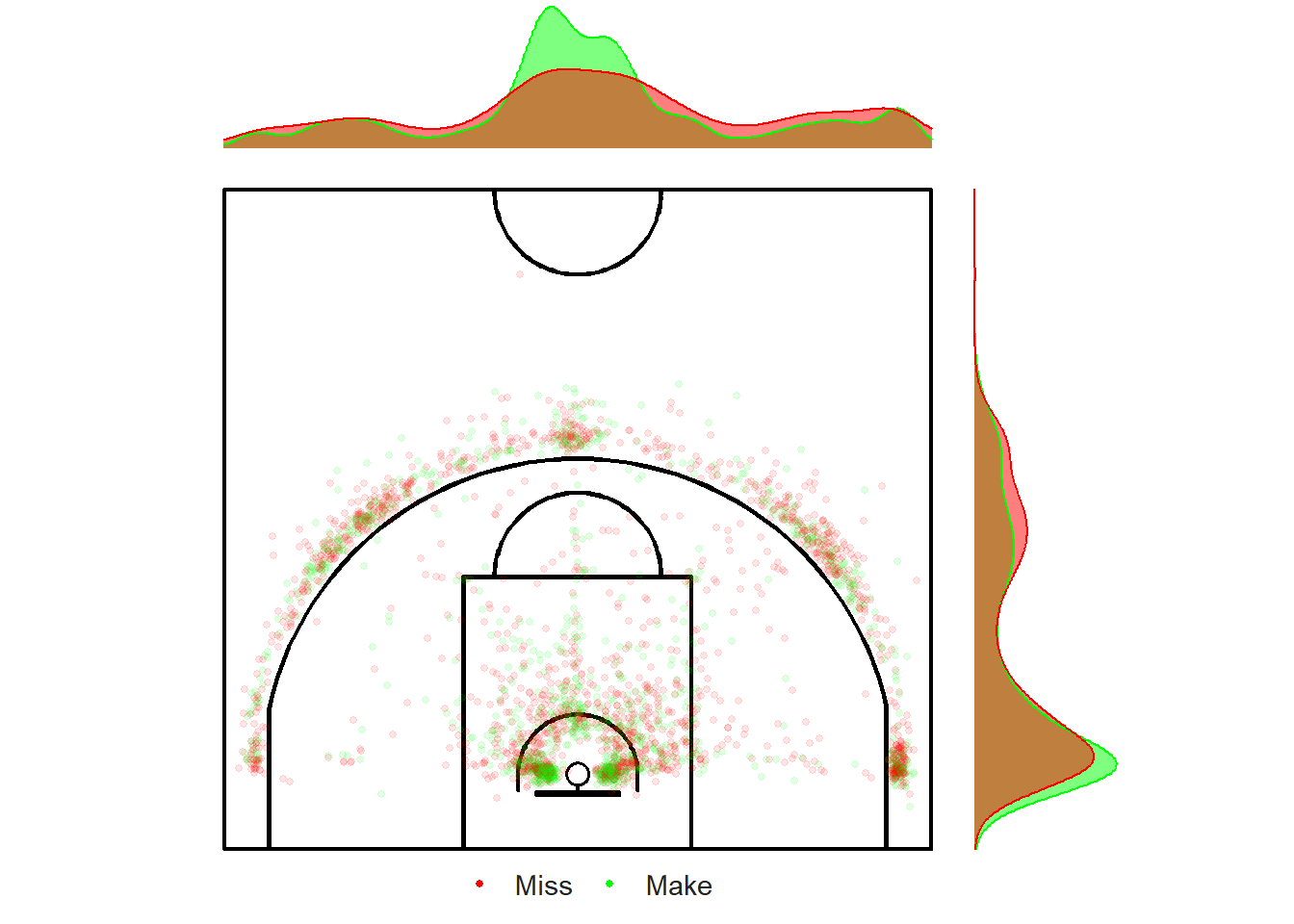
Figure 11.9: Looking under the rug.
Figure 11.9 contains a ton a valuable information. Let's start by looking at the marginal distribution of the \(x\) component located at the top of the graph. We see that most occur at the center of the court. We also see that more shots take place from the left side (from the shooter's perspective) than the right side of the court . Based on the scatter plot, it looks like more shots come from the left corner-three rather than the right corner-three.
The marginal distributions located on the right of the plot tell us that the vast majority of shots have \(y\) component in the range of 1-3 meters. This makes sense given the number of shots coming from the restricted area and from the corners. The other bump in density occurs near the top of the three-point line. Again, this makes sense given what we know from the obvious clustering in the data.
11.3.2 How It Works (ish) - 2D
Kernel Density Estimation can also used to estimate the density of data set with two dimensions. This is perfect for trying to figure out where the basketball shots are likely to occur given a bunch of \((x, ~y)\) coordinates.
Figure 11.10: Ding Don! It looks like a bell.
The default kernel when working in two dimensions will be a Bivariate Normal Distribution. Figure 11.10 shows a 3D bell curve centered at the point \((7.5, ~ 5)\). The density can also be visualized in 2D using a contour plot or a heatmap.
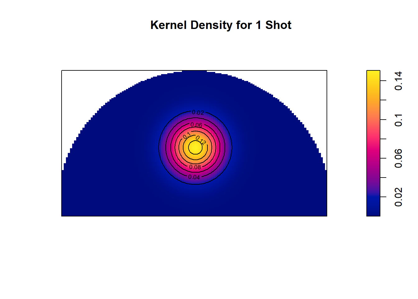
Figure 11.11: One drop of ink located at (7.5,5)
You can think of Figure 11.11 (and kernel density estimation in general) as a drop of yellow ink on a blue sheet of paper. The highest density is found at the location of the shot and the density decays as you move radially outwards at a rate that depends on the kernel and parameters of choice.
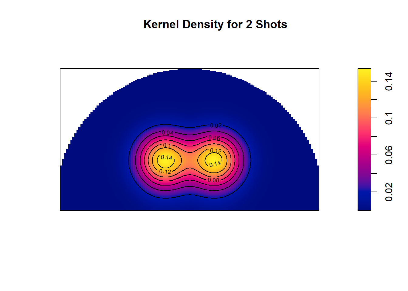
Figure 11.12: Two drops of ink located at (6,4) & (9, 4)
This idea can be extended to multiple points as seen in Figure 11.12. The yellow ink of each points combine in the middle. You can think of it as the height of each kernel combining to make a mega mountain with peaks at the locations with the most shots as seen in Figure 11.13 below.
Figure 11.13: Ding Dong
Now that we know the basics of 2D KDE, let's use the geom_density_2d_filled() function from the ggplot2 package to create our heatmaps83. By default, this function uses a Gaussian kernel (3D bell curve). The bandwidths84 are determined using the bandwidth.nrd(x) function from the MASS package.
# Load the MASS library
library(MASS)

# Default Bandwidths
h_x <- bandwidth.nrd(shots_3000_tb$loc_x)
h_y <- bandwidth.nrd(shots_3000_tb$loc_y)
In our case, the default bandwidth in the \(x\)-direction is 2.33 and the default bandwidth in the \(y\)-direction is 2.18. Figure 11.14 below uses these default bandwidths to create a regular density contour plot.
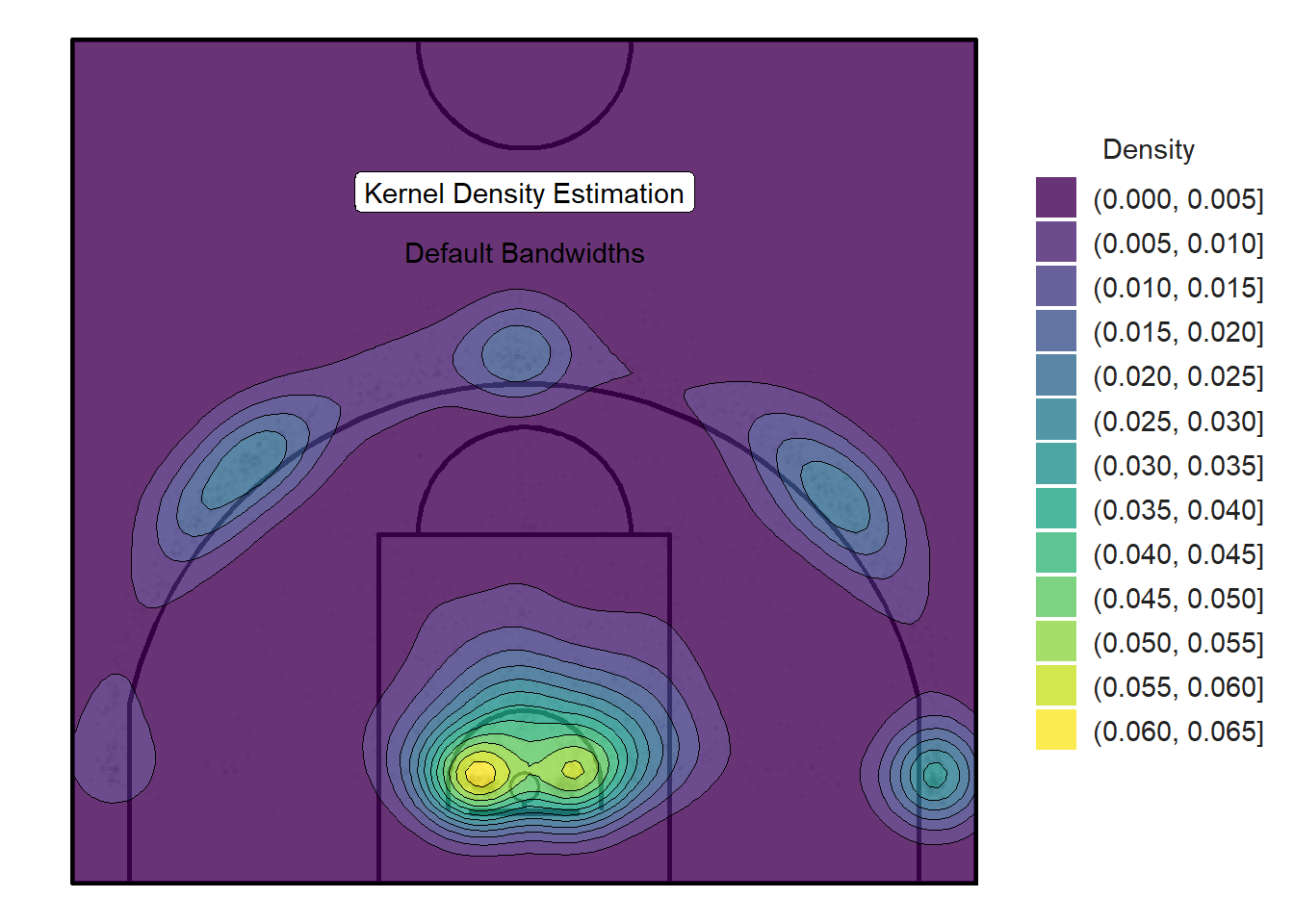
Figure 11.14: Default kernel density plot obtained with ggplot and the MASS package
We see that the default values for the bandwidth h do a pretty good job. The same 5 spots discovered through clustering in the previous chapter are evident in Figure 11.14. The highest density is found near the rim which is consistent with previous observations.
But how can we interpret the numbers in the legend?
The numbers on the right of Figure 11.14 represent the probability density function (pdf) for the kernel density estimation85. They are the probability per unit area (squared meters in our case) of a randomly selected shot from our sample to be located in the regions coloured by the particular contour level.
With some ingenuity, these statistics can be obtained86. The coordinates of the contour lines can be computed manually and converted to sf objects. We can then calculate the areas of the polygons formed by the contour lines. The distinct contour areas are obtained by subtracting the areas of the contours one level above them. The nice thing about working with spatial objects is that we can use the st_join() function to determine which shots fall within each contour. The results are displayed in Table 11.2 below.
| density_mid | distinct_contour_area | distinct_contour_prob | distinct_contour_shots | density_lower | density_upper | contour_area | total_area | area_frac | contour_shots | total_shots | shots_frac | contour_intensity | distinct_contour_shots_frac | distinct_contour_area_frac | distinct_contour_density |
|---|---|---|---|---|---|---|---|---|---|---|---|---|---|---|---|
| 0.0025 | 158.3449 | 0.3959 | 299 | 0.000 | 0.005 | 210.0000 | 210 | 1.0000 | 2805 | 2805 | 1.0000 | 13.3571 | 0.1066 | 0.7540 | 1.8883 |
| 0.0075 | 23.4204 | 0.1757 | 363 | 0.005 | 0.010 | 51.6551 | 210 | 0.2460 | 2506 | 2805 | 0.8934 | 48.5141 | 0.1294 | 0.1115 | 15.4993 |
| 0.0125 | 9.8779 | 0.1235 | 229 | 0.010 | 0.015 | 28.2347 | 210 | 0.1345 | 2143 | 2805 | 0.7640 | 75.8995 | 0.0816 | 0.0470 | 23.1830 |
| 0.0175 | 6.6125 | 0.1157 | 361 | 0.015 | 0.020 | 18.3568 | 210 | 0.0874 | 1914 | 2805 | 0.6824 | 104.2668 | 0.1287 | 0.0315 | 54.5935 |
| 0.0225 | 4.0385 | 0.0909 | 372 | 0.020 | 0.025 | 11.7442 | 210 | 0.0559 | 1553 | 2805 | 0.5537 | 132.2350 | 0.1326 | 0.0192 | 92.1137 |
| 0.0275 | 1.7844 | 0.0491 | 163 | 0.025 | 0.030 | 7.7058 | 210 | 0.0367 | 1181 | 2805 | 0.4210 | 153.2620 | 0.0581 | 0.0085 | 91.3449 |
| 0.0325 | 1.2765 | 0.0415 | 163 | 0.030 | 0.035 | 5.9213 | 210 | 0.0282 | 1018 | 2805 | 0.3629 | 171.9214 | 0.0581 | 0.0061 | 127.6930 |
| 0.0375 | 1.0788 | 0.0405 | 107 | 0.035 | 0.040 | 4.6448 | 210 | 0.0221 | 855 | 2805 | 0.3048 | 184.0763 | 0.0381 | 0.0051 | 99.1831 |
| 0.0425 | 1.0166 | 0.0432 | 119 | 0.040 | 0.045 | 3.5660 | 210 | 0.0170 | 748 | 2805 | 0.2667 | 209.7589 | 0.0424 | 0.0048 | 117.0593 |
| 0.0475 | 1.0601 | 0.0504 | 143 | 0.045 | 0.050 | 2.5494 | 210 | 0.0121 | 629 | 2805 | 0.2242 | 246.7228 | 0.0510 | 0.0050 | 134.8985 |
| 0.0525 | 0.9756 | 0.0512 | 225 | 0.050 | 0.055 | 1.4894 | 210 | 0.0071 | 486 | 2805 | 0.1733 | 326.3137 | 0.0802 | 0.0046 | 230.6278 |
| 0.0575 | 0.3761 | 0.0216 | 163 | 0.055 | 0.060 | 0.5138 | 210 | 0.0024 | 261 | 2805 | 0.0930 | 508.0131 | 0.0581 | 0.0018 | 433.3806 |
| 0.0625 | 0.1377 | 0.0086 | 98 | 0.060 | 0.065 | 0.1377 | 210 | 0.0007 | 98 | 2805 | 0.0349 | 711.9327 | 0.0349 | 0.0007 | 711.9327 |
What is the probability of a shot falling in a contour?
Now that we are working in two dimensions, we can't simply find the area under the density curve as we did in the one-dimensional case of Figure 11.7. Instead, we need to calculate the volume under the 3D surface of the court shown in Figure 11.15. The \(x\) and \(y\) axes denote the grid cell identification number used for the kernel density estimation. The height denoted by \(z\) indicates the density for the specified cell. Note that the graph seems to be mirrored about the \(y\)-axis. In other words, the peak of the right corner-three should really be positioned in the left corner-three.
Figure 11.15: The mountain range of basketball
That said, the distinct_contour_prob column of Table 11.2 is the volume under the distinct contour levels. For example, the largest contour level with density between 0 and 0.005 has an area of 158.34 squared meters. This makes sense given that the area of the entire half-court is \(15\mbox{m} \times 14\mbox{m} = 210 \mbox{m}^2\). Now, the volume under the dark purple area depends on the average height of this region. If we take the mid-point of 0 and 0.005 we get a height of 0.0025. This results in a volume under the contour of approximately
\[ V = A_{\mbox{contour}} \times h_{\mbox{contour}} = 158 \times 0.0025 = 0.4 \mbox{m}^3. \]
This means that we can expect based on this approximation that 39.59% of randomly selected shots from our sample to come from this area. In reality, there is only 299 shots in this massive area. This represents only 10.66% of the 2805 shots in the sample. This suggests that the average height of this region is most likely closer to zero than 0.005.
Of course, this mid-point method is flawed. We would need to use integrals to precisely estimate the volume under each contour line. Let's consider the highest contour with density between 0.06 and 0.065 and an area of 0.14 squared meters. This represents where many of the right layups occur. There are still 98 shots in this tiny area. This explains why the density is so high at this area. Now, the volume under this bright-yellow near circular region is essentially a cylinder of height 0.0625. This time the volume is \(V = A_{\mbox{contour}} \times h_{\mbox{contour}} = 0.14 \times 0.0625 = 0.01 \mbox{m}^3\).
This means that we can expect roughly 0.86% of shots to come from this area. This time, there is really 98 shots which represents 3.49% of the 2805 shots in the sample. We see that the mid-point technique underestimated the actual number of shots in this region.
11.4 Basketball Density Plots in R
The blobs are fairly large and spill over the three-point line. We've learn from Figure 11.4 that there very little shots that are released in the first feet inside the three-point line. As a result, we can set the adjust argument of the geom_density_2d_filled() function to 0.5 to half the default bandwidths. Thus, Figure 11.16 below use bandwidths of 1.16 and 1.09 in and the \(x\) and \(y\) directions respectively. Feel free to refer to Figure 11.5 to recall the effects of changing the bandwidth on the density estimation.
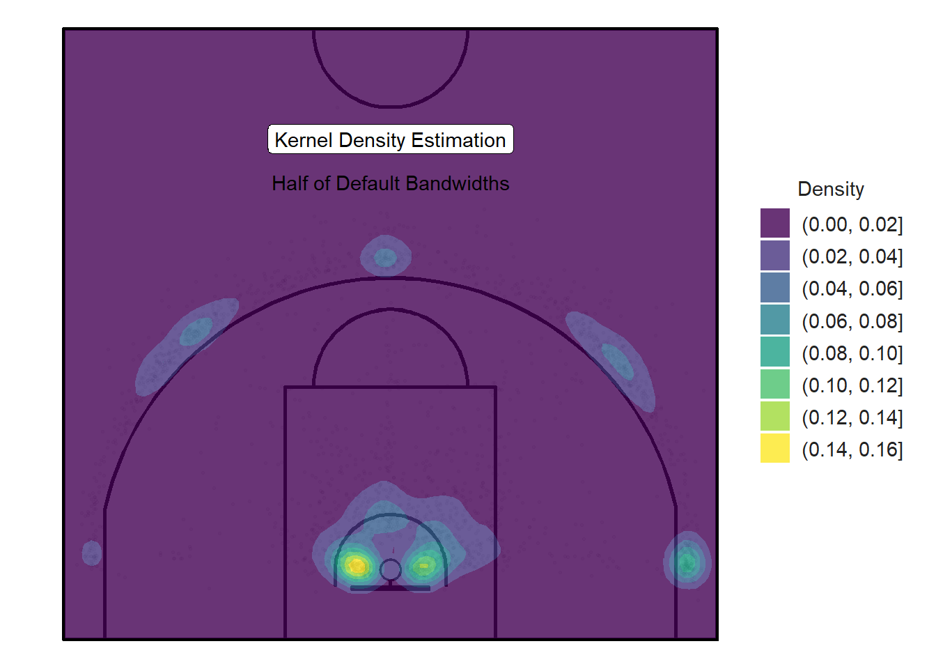
Figure 11.16: Smaller blobs with higher densities
Figure 11.16 above does a much cleaner job of representing the popular spots to shoot from. The smaller bandwidths limit the spillage and lead to blobs with higher densities than the previous plot.
We can build on the ideas and design from the previous density plots and normalize the densities so the values are between zero and one. That way, we can easily drop the smaller normalized densities values (between 0 and 0.1) by manipulating the breaks argument.
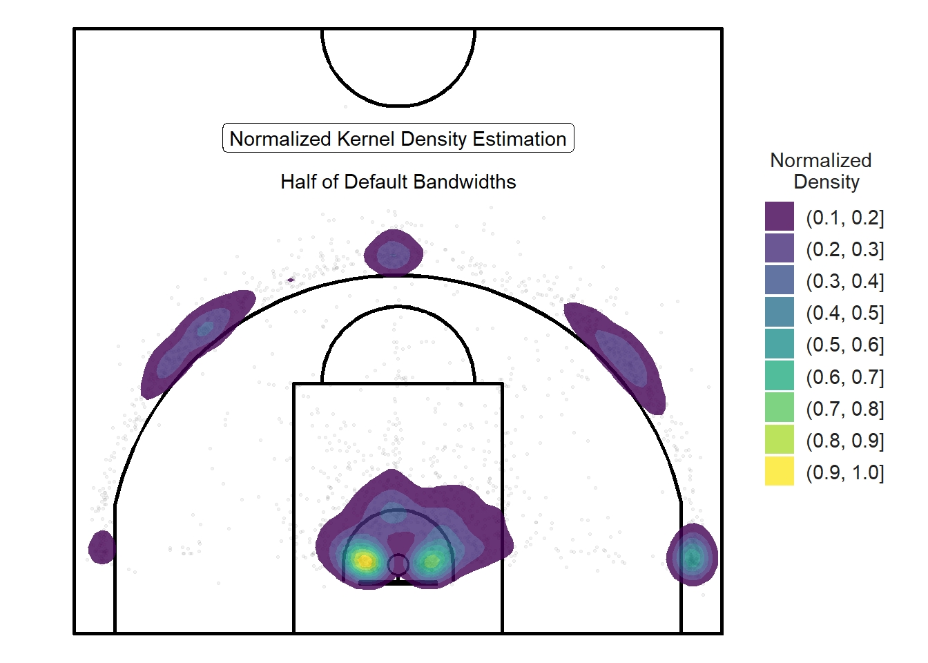
Figure 11.17: Dropping the lowest normalized densities
The legend of this normalized density plot (Figure 11.17) is even more difficult to interpret than the legend for a regular density plot such as Figure 11.16. For our purposes, the main advantage of normalizing a density plot is so we can easily drop the lowest or highest density values. For this reason, we will omit the legend since we are only interested in where shots are likely to take place relative to other locations.
11.4.1 Player Density Plots
Let's create normalized density plots for each player. Note that many players in the sample did not take enough shots to create meaningful plots so we will only include the players who took at least 175 shots. This can easily be achieved using the facet_wrap(~player) line of code.
# Density estimate, scaled to a maximum of 1.
plot_court() +
  geom_point(data = qualified_shots, aes(x = loc_x, y = loc_y),
             size = 1, alpha = 0.2) +
  geom_density_2d_filled(
    data = qualified_shots,
    aes(x = loc_x, y = loc_y, fill = ..level..),
    contour_var = "ndensity", # normalize density
    breaks = seq(0.2, 1.0, by = 0.1), # drop the lowest
    adjust = 0.5, # Half the default bandwidth
    alpha = 0.8,
    show.legend = FALSE
  ) +
  lims(x= c(0, width), y = c(0, height)) +
  facet_wrap(~player)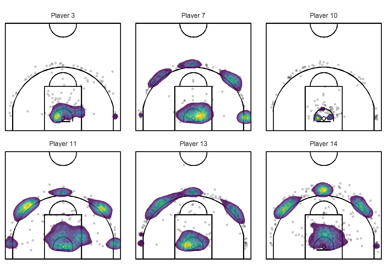
Figure 11.18: Different types of shot patterns indeed
These plots could be very useful to players and coaches. They tell you at a glance if the player is taking the bulk of their shots where you want them to take them. You can clearly see from Figure 11.18 above that players have different shooting patterns. Player takes many layups while Player 11 shoots more three-point attempts.
Consider the shiny application below that allows the user to filter the density plots based on the player and the type of shots. The application may be best viewed on a computer or on a tablet in a separate page.
Figure 11.19: You can acces the application here!
11.5 Hot Spot Analysis
So far, we have looked at where shots were likely to take place based on our sample data. The interesting question is:
What regions of the court has the team shot most accurately?
The first thing we can do to try to answer this question is to create separate heatmaps for made and missed shots.
# The density estimate
plot_court() +
  geom_point(data = shots_3000_tb, aes(x = loc_x, y = loc_y),
             size = 0.5, alpha = 0.05) +
  geom_density_2d_filled(
      data = shots_3000_tb,
      aes(x = loc_x, y = loc_y, fill = ..level..),
      # Regular density
      contour_var = "ndensity",
      breaks = seq(0.1, 1.0, by = 0.1), # drop the lowest
      adjust = 0.5,
      alpha = 0.8,
      show.legend = FALSE
    ) +
  facet_wrap(vars(shot_made_factor))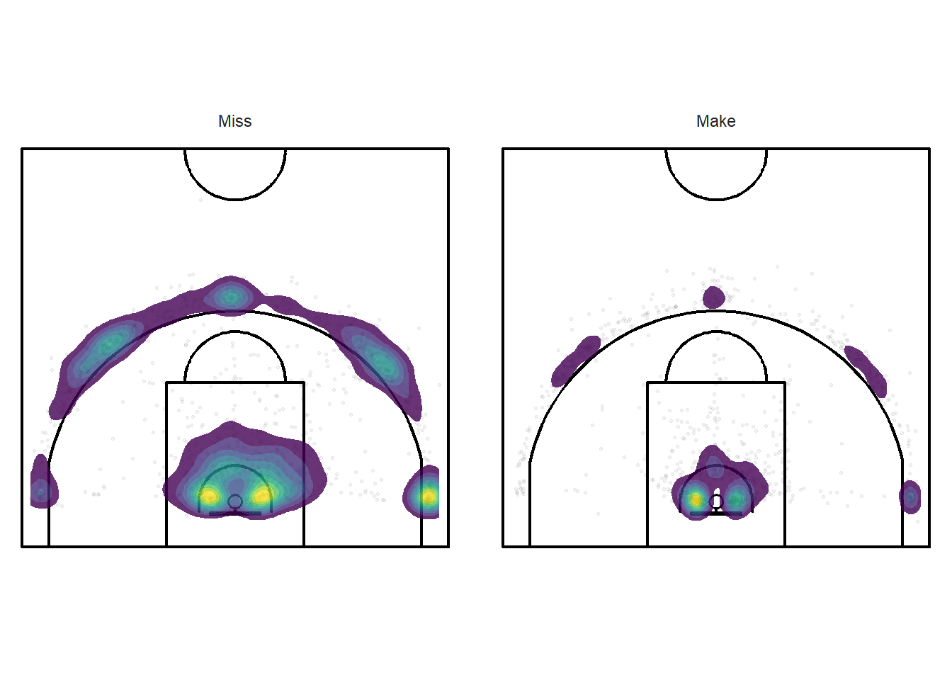
Figure 11.20: This is probably not going to be too informative.
It is important to keep in mind when looking at Figure 11.20 above that there were more missed shots (1638) than made shots (1167). The overall shooting percentage was 41.6%. We see that the made layups are more condensed around the rim than missed attempts. We also see that made layups were more common than made three-pointers.
Next, we can try to divide the densities of made shots by the densities of all shots to get an estimate of accuracy for every location on the floor. We will only focus on the grey region in Figure 11.21 below since there aren't enough shots in the other regions of the half-court.
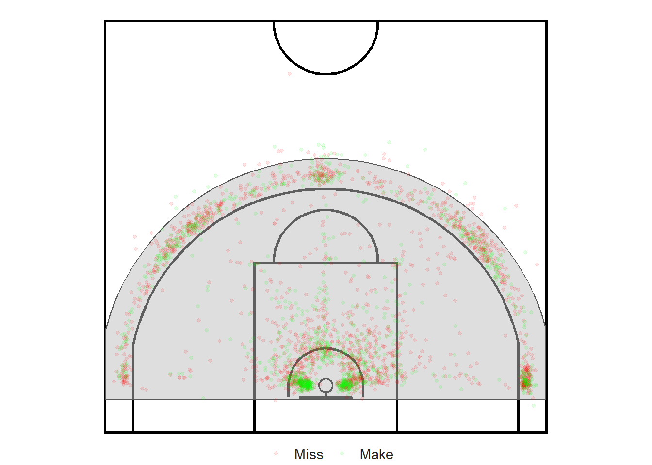
Figure 11.21: Observation window for our hot spot analysis
# only keep the shots that are in the window
shots_window <- shots_3000_sf[window_points, ]

# Create a ppp object
shots_ppp <- ppp(
  x = st_coordinates(shots_window)[, 1],
  y = st_coordinates(shots_window)[, 2],
  window = window,
  marks = shots_window$shot_made_factor
)

shots_splits <- split(shots_ppp)

shot_densities <- density(shots_splits)

# Make / Total
frac_shot_made_density <- shot_densities[[2]] / (shot_densities[[1]] + shot_densities[[2]])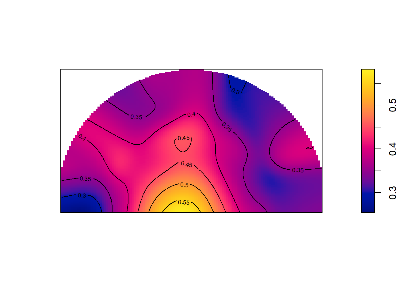
Figure 11.22: Some hot layups!
Figure 11.22 is difficult to read since we cannot see the court lines for reference below. That said, the shape of the window resembles the shape of the court enough that we can make some reasonable inferences from this plot. It is clear that layups have the highest accuracy at around 50%. The accuracy of the three-point shots in the sample hover around 35%. There might be some slight left-right differences in accuracy.
We will investigate further the accuracy of different spots on the floor in the interpolation chapter. Building models will allow us to get some uncertainty estimates for the predicted accuracy. With Figure 11.22, we can be pretty certain that the accuracy of layups hover around 50% given the large number of attempts in this area. However, our accuracy estimates from the mid-range almost certainly has a large error given our sparse data. We will learn how we can use advanced machine learning techniques to address these issues.
Note that all the R code used in this book is accessible on GitHub.