12 Spatial Interpolation with GAMs
Note that all the R code used in this book is accessible on GitHub.
The density plots from Chapter 11 were effective at telling us where the shots are coming from but not so great at telling us where the team is shooting accurately from. Figure 11.22, the last figure from the previous chapter, attempts to address this accuracy issue but fails to provide uncertainty estimates for its predictions. As a result, we will use our modeling skills developed in Chapter 3 to build spatial models. In particular, we'll use Generalized Additive Models (GAMs) to conduct our spatial interpolation.
Again, let's load the larger dataset. We will need as much data as possible to "accurately" predict the shooting percentage for every spot on the floor even for locations that do not have many or any shots.
# Load the larger dataset
shots_tb <- readRDS(file = "data/shots_3000_tb.rds")

# Load large spatial shots data
shots_sf <- readRDS(file = "data/shots_3000_sf.rds")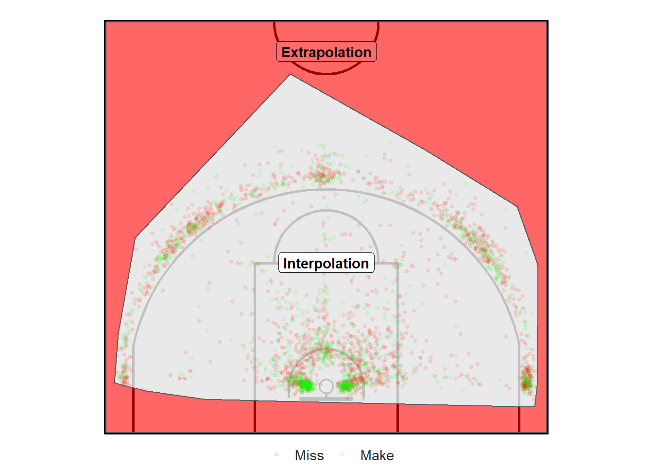
Figure 12.1: Interpolation versus Extrapolation
Interpolation would be to predict the accuracy of every possible \((x, ~y)\) coordinate inside of the convex hull surrounding the shots in Figure 12.1 (the grey region). Predictions in the red region would be an example of extrapolation.
The data is too sparse for shots further than 8.5 meters from the hoop and for shots below the backboard to make any reasonable inference about their likelihood of going in. Thus, we'll focus our analysis on the region displayed in Figure 12.2.
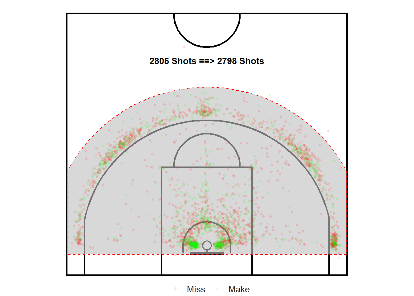
Figure 12.2: Only focus on the shots within the region of interest
12.1 Team Level
A team might be interested in trying to answer two questions:
What is the team's accuracy from every spot on the half-court?
How does a specific player's shot-making abilities compare to the rest of the team?
We will start by attempting to answer the first question using GAMs. Much of the analysis of this chapter is based on Noam Ross' free interactive course: GAMs in R.
12.1.1 Coordinates Only Model
Let's fit a GAM model using the \((x, ~y)\) coordinates to predict the binary outcome of the shots. Note that this ignores who took the shot and all other potentially relevant variables.
"A common way to model geospatial data is to use an interaction term of x and y coordinates, along with individual terms for other predictors. The interaction term then accounts for the spatial structure of the data." — Noam Ross - GAMs in R (Chapter 3)
# Load the mgcv library to fit GAM models
library(mgcv)

# GAM model based on shot coordinates
coord_mod <- gam(
  shot_made_numeric ~ s(loc_x, loc_y),
  data = near_shots, method = "REML", family = binomial)
##
## Family: binomial
## Link function: logit
##
## Formula:
## shot_made_numeric ~ s(loc_x, loc_y)
##
## Parametric coefficients:
## Estimate Std. Error z value Pr(>|z|)
## (Intercept) -0.34964 0.03929 -8.898 <2e-16 ***
## ---
## Signif. codes: 0 '***' 0.001 '**' 0.01 '*' 0.05 '.' 0.1 ' ' 1
##
## Approximate significance of smooth terms:
## edf Ref.df Chi.sq p-value
## s(loc_x,loc_y) 19.6 24.3 133.1 <2e-16 ***
## ---
## Signif. codes: 0 '***' 0.001 '**' 0.01 '*' 0.05 '.' 0.1 ' ' 1
##
## R-sq.(adj) = 0.0507 Deviance explained = 4.22%
## -REML = 1855.8 Scale est. = 1 n = 2798## # A tibble: 1 x 7
## df logLik AIC BIC deviance df.residual nobs
## <dbl> <dbl> <dbl> <dbl> <dbl> <dbl> <int>
## 1 20.6 -1819. 3681. 3809. 3638. 2777. 2798We see that both the intercept and the interaction term s(loc_x, loc_y) have very small p-values which means that there's a significant relationship between whether a shot was made or not and the location of that shot. The effective degrees of freedom edf = 19.6036484 "represents the complexity of the smooth. An edf of 1 is equivalent to a straight line. An edf of 2 is equivalent to a quadratic curve, and so on, with higher edfs describing more wiggly curves."87
It's important to note that outputs of our model summary are on the log-odds scale. As seen in Chapter 3, we can use the logistic function to convert the log-odds to probabilities. Here, the value of the intercept is -0.3496356. We can use the plogis() function to convert it to a probability.
\[ \mbox{logit}^{-1}(-0.3496356) = \frac{e^{-0.3496356}}{e^{-0.3496356} + 1} = 0.4134708 \]
On the probability-scale, the intercept is about 0.41. This means that the model predicts a 41.35% baseline chance of a made shot. This makes sense given that the overall shooting percentage of the sample is roughly 42%.
We can easily visualize our model results using the plot() function as shown in Figure 12.3 below. "The interior is a topographic map of predicted values. The contour lines represent points of equal predicted values, and they are labeled. The dotted lines show uncertainty in prediction; they represent how contour lines would move if predictions were one standard error higher or lower."88
plot(coord_mod, asp = 1)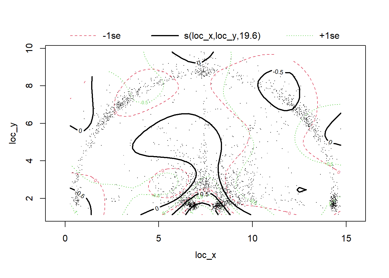
Figure 12.3: Not a very useful plot...
Recall that the predicted values are on the log-odds scale by default. The contour line with a value of \(0\) in Figure 12.3 indicates a region with a \(50\)% chance of making a basket. Contour lines with a value of \(-0.5\) represent a 38% chance of a successful outcome. Similarly, the contours near the rim have log-odds values between \(0.5\) and \(1\) which would correspond to probabilities between 62% and 73%. This makes sense given our previous knowledge of basketball shots.
We can easily improve the readability of Figure 12.3 by setting the trans argument to plogis to convert the log-odds to probabilities. Setting the scheme argument to \(2\) creates a heat map with contour lines. We can add a point centered at the rim to add a reference point. The location of the three-point line is evident from the cloud of points surrounding it.
plot(coord_mod, trans = plogis, scheme = 2, asp = 1)
points(x = width/2, y = hoop_center_y, col = "black", pch = 1, cex = 2.5)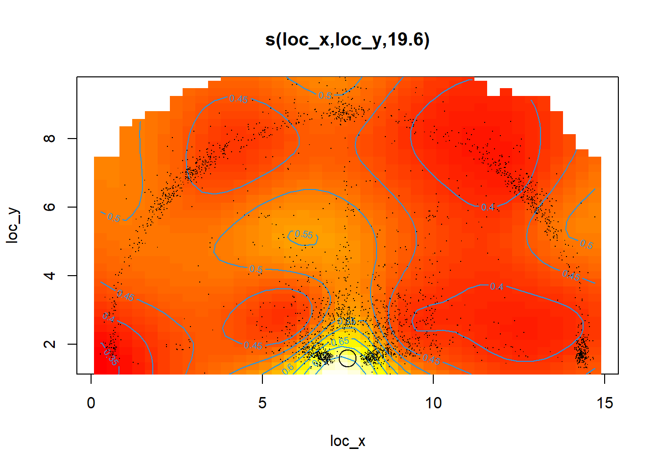
Figure 12.4: Much more useful plot!
We see from Figure 12.4 that the accuracy of the shots decreases rapidly as we move away from the basket. Right-handed layups seem to be slightly more accurate than left-handed layups. Other than that, the accuracy is roughly symmetric between the left and right side of the court.
It requires a bit of creativity to plot the outputs of our model on the basketball court we built using ggplot289. Dr. Barry Rowlingson is to thank for some of the code used to create the next few charts. Their DataCamp course on Spatial Statistics in R has also been of great help throughout the book.
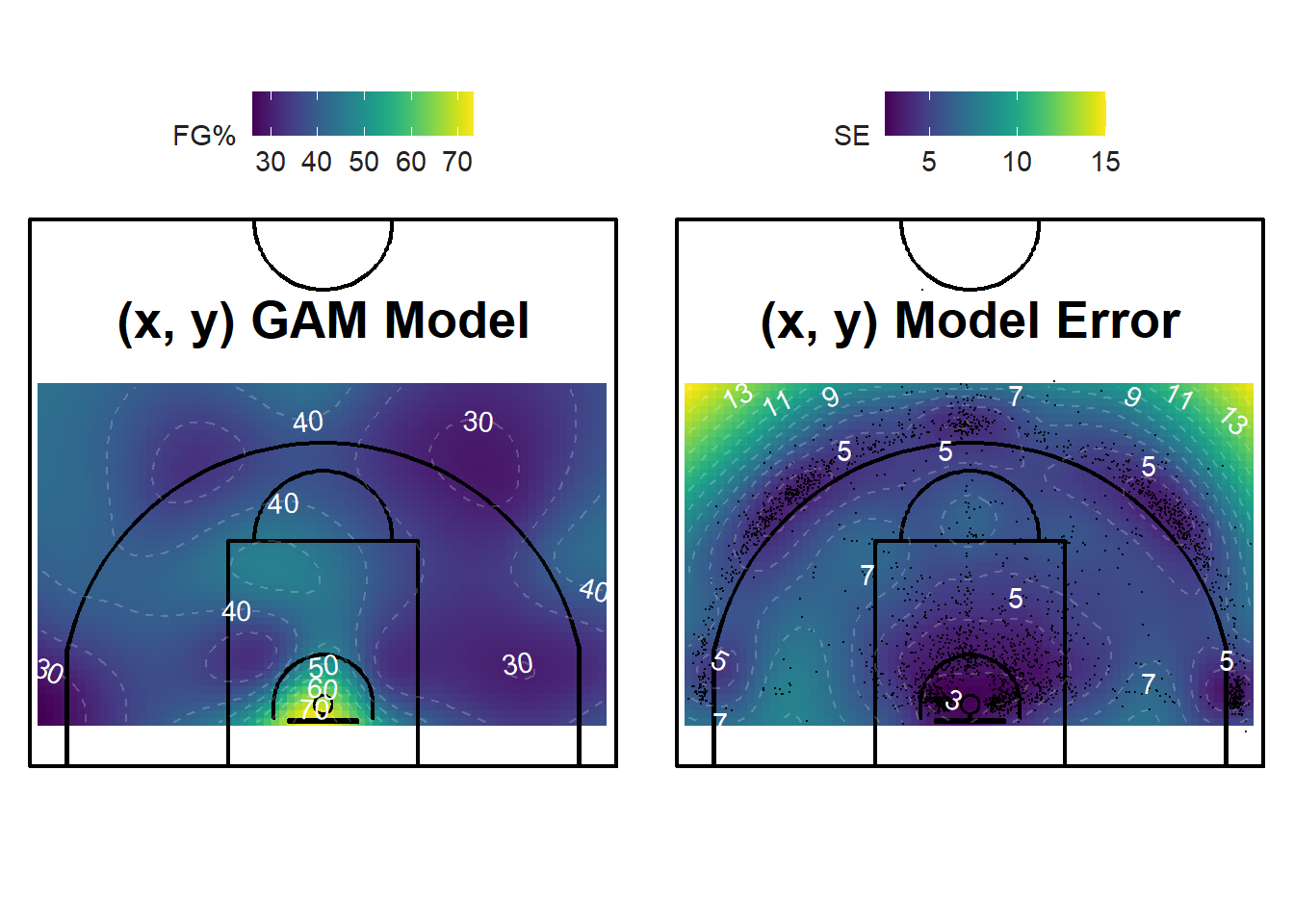
Figure 12.5: Less Shots = More Error!
The plot on the left of Figure 12.5 displays the shooting percentage for all locations in the region of interest. By default, our function splits the region of interest into a grid of 20 cm by 20 cm cells. The cells can be smaller if a smoother picture is required. Again, we see that the shots near the rim have a higher success probability. There is no obvious pattern for the rest of the half-court.
The plot on the right of Figure 12.5 displays the uncertainty (standard error) of our predictions. As expected, the regions with many shots have low uncertainty while the sparse regions have high uncertainty. The yellow spots in the top-corners of the plot have high uncertainty since there are little to no shots in those regions. Thus, the model is trying to extrapolate too far from the regions of high-information.
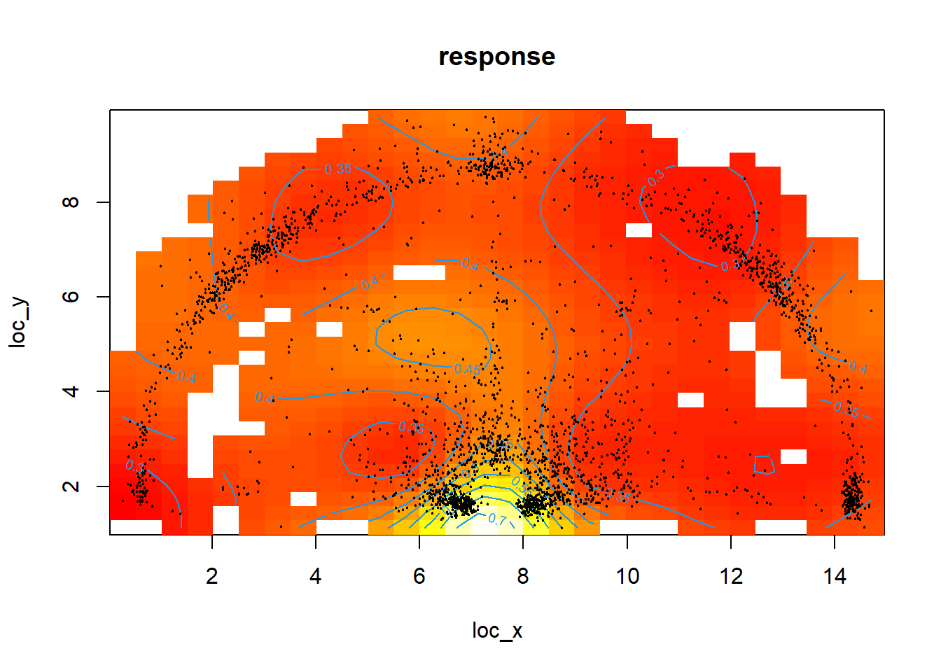
Figure 12.6: Oops! That might have been too far...
We can use the vis.gam() function from the mgcv package to prevent the plot from extrapolating too far from our data. Figure 12.6 above has the too.far argument set to \(0.05\). We see that the regions of the court without any points nearby are simply plotted as white squares. This approach only takes into account the distance of a shot to it's neighbours.
Hence, it may be a better approach to only plot the grid cells that have a standard error under a specific threshold. Figure 12.7 below only plots the predictions with a standard error less than 7. This is a pretty good way of limiting the grandiosity of our claims given the significant uncertainty of our estimates. We could easily improve on these models and plots given more data in the sparse regions. This is where tracking a team's practice data may come in handy.
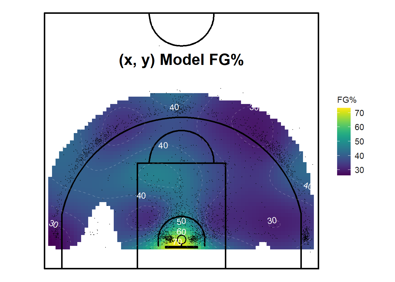
Figure 12.7: Only show the confident predictions.
We can also visualize the smoothed shooting percentage in three dimensions as shown in Figure 12.8 below. Just note that the left-right coordinates appear to be reflected for some reason. Plotting the basketball court under the 3D surface would greatly help with interpretation.
Figure 12.8: Difficult to interpret without the court
Another way to get a sense of where the best spots to shoot from is to find the areas with the greatest values of expected points per shot.
\[ \mbox{Expected Points per Shot} = \mbox{xPPS} = \mbox{Shooting Percentage} \times \mbox{Shot Value} \]
Shooting \(40\)% from the three-point area results in \(0.4 \times 3 = 1.2\) points per shot while shooting \(55\)% from the two-point area results in \(0.55 \times 2 = 1.1\) points per shot. This means that the average three-pointer was more efficient than the average two-pointer for this example. As seen in the first chapter, the shooting percentage of a two-point shooter needs to be 1.5 times greater than the shooting percentage of a three-point shooter for the expected points per shot to be equal.
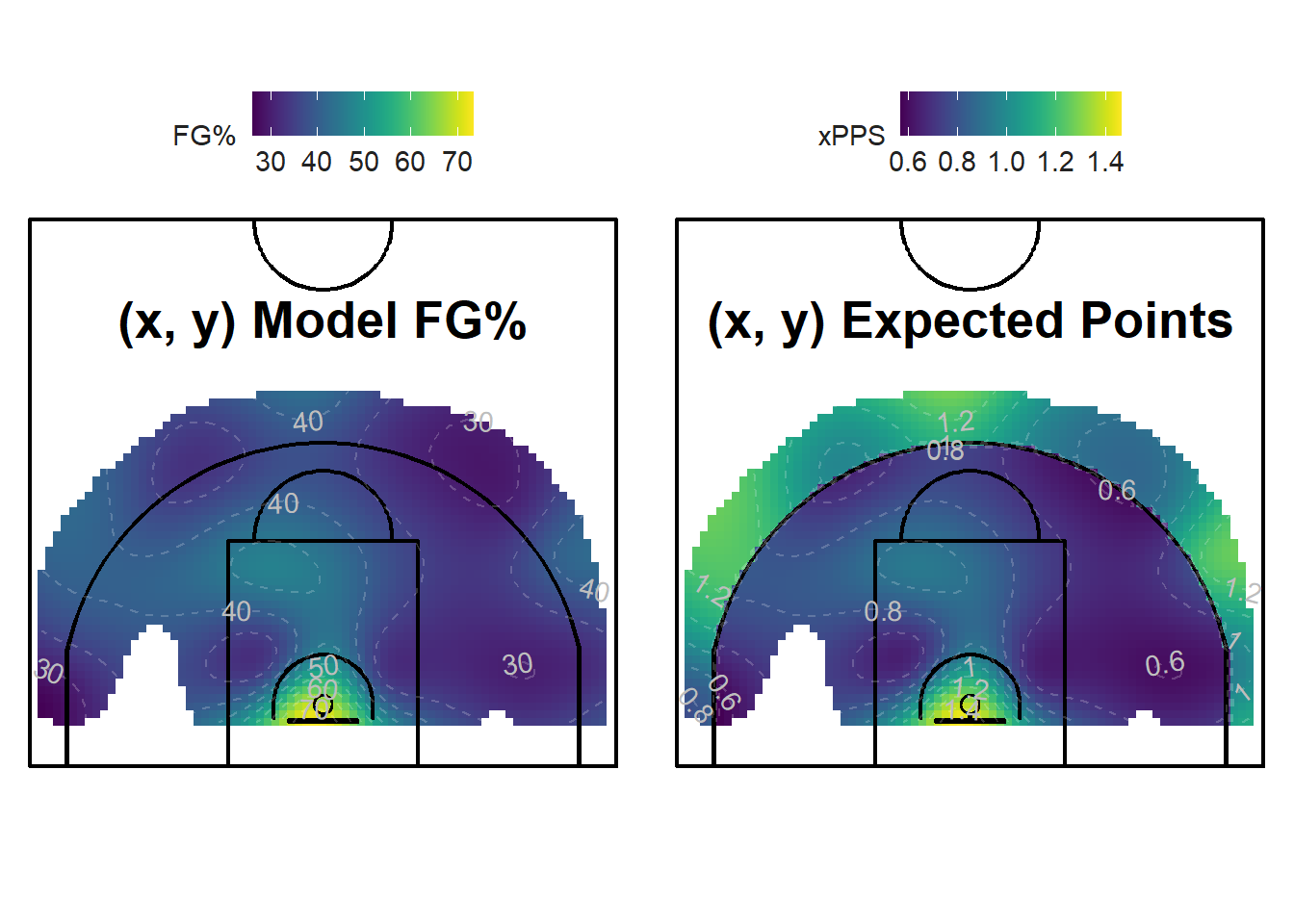
Figure 12.9: The three-point range comes alive!
It's not obvious where the most efficient places to shoot from are when looking at the shooting percentage plot on the left of Figure 12.9. The only spot that stands out are the layups in bright yellow. We see that the average layup has a success probability of around \(65\)% while the rest the half-court's accuracy hovers between \(30\)% and \(45\)%.
It's a different story if we look at the plot on the right of Figure 12.9. The region past the three-point line has comparable expected points per shot values than layups. The corner-threes are efficient options as well even though the right-corner seems to be slightly less efficient for the shots in our sample. The mid-range is relatively dark which indicates a lower quality of shots.
12.2 Player Level
We will now tackle the second question posed earlier in the chapter.
How does a specific player's shot-making abilities compare to the rest of the team?
The model built using only the \((x, ~y)\) coordinates of the shots failed to take into account who is shooting. A knowledgeable observer can make a reasonable guess at how likely a specific player is to make a shot given where they shoot from. Different players will likely have different success rates when shooting from the same locations. Of course, there are more factors that affect the probability of making shots other than the location and the shooter. The distance to the closest defender, the time remaining on the shot clock, and the player's speed prior to the shot are a few examples of variables that might help predict whether a shot will go in or not.
Nevertheless, let's fit a GAM model using the \((x, ~y)\) coordinates of the shots and the player as our three predictor variables to predict the binary outcome of the shot. By setting the bs argument of the gam() function to fs, we can model the categorical-continuous interaction between the player and the \((x, ~y)\) coordinates of the shots.
"With factor-smooths, we do not get a different term for each level of the categorical variable. Rather, we get one overall interaction term. This means that they are not as good for distinguishing between categories. However, factor smooths are good for controlling for the effects of categories that are not our main variables of interest, especially when there are very many categories, or only a few data points in some categories." — Noam Ross - GAMs in R (Chapter 3)
The factor-smooth approach seems to be perfect for our application. We do not care to have a term for each player. We can look at the raw shooting percentages if we wanted to rank players. Instead, we want to see how the accuracy of different players varies by location. It is also important to note that some of the players took very few shots compared to others which makes the factor-smooth approach that much more appealing.
coord_player_mod <- gam(
  shot_made_numeric ~ s(loc_x, loc_y, player, bs = "fs"),
  data = near_shots, method = "REML", family = binomial)
##
## Family: binomial
## Link function: logit
##
## Formula:
## shot_made_numeric ~ s(loc_x, loc_y, player, bs = "fs")
##
## Parametric coefficients:
## Estimate Std. Error z value Pr(>|z|)
## (Intercept) -0.44567 0.08336 -5.346 8.97e-08 ***
## ---
## Signif. codes: 0 '***' 0.001 '**' 0.01 '*' 0.05 '.' 0.1 ' ' 1
##
## Approximate significance of smooth terms:
## edf Ref.df Chi.sq p-value
## s(loc_x,loc_y,player) 61.67 539 141.9 <2e-16 ***
## ---
## Signif. codes: 0 '***' 0.001 '**' 0.01 '*' 0.05 '.' 0.1 ' ' 1
##
## R-sq.(adj) = 0.0509 Deviance explained = 5.44%
## -REML = 1876.7 Scale est. = 1 n = 2798## # A tibble: 1 x 7
## df logLik AIC BIC deviance df.residual nobs
## <dbl> <dbl> <dbl> <dbl> <dbl> <dbl> <int>
## 1 62.7 -1796. 3731. 4144. 3592. 2735. 2798We see that both the intercept and the interaction term are significant. Since this model differentiates its predictions based on who is shooting the ball, we can create a shot chart for each player and make the colour of the dots representative of the expected points per shot for the specific player and location. Figure 12.10 displays such maps for the six guards who took the most shots in the sample.
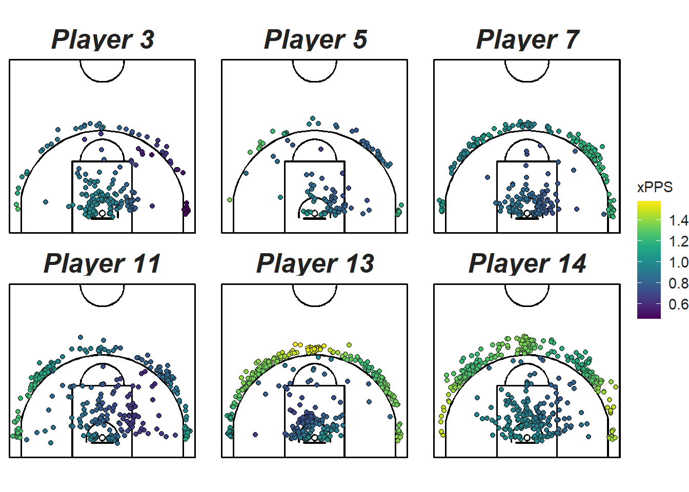
Figure 12.10: Comparing the six guards who take the most shots
We see that the predictions (colours) differ significantly across players at the same location. Figure 12.11 compares the predicted efficiency of the post players. We see for example that Player 10 is predicted to be more efficient near the rim while Player 7 is more efficient at the top of the arc.
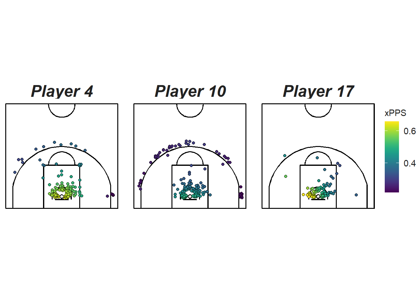
Figure 12.11: Comparing the six posts who take the most shots
The factor-smooth model from the section above provides evidence for the basic intuition that some players are better at shooting from some locations than others. Given more data, building separate models for each player could improve the predictability of our current model.
We will see in the next chapter how we can use these models to try to quantify the shot making ability of players relative to their teammates.
Note that all the R code used in this book is accessible on GitHub.