9 Nearest Neighbour Analysis
Note that all the R code used in this book is accessible on GitHub.
The quadrat analysis of Chapter 8 did not consider the arrangement of points in relation to one another. We can calculate the distance between each shot and its nearest neighbour to counteract theses limitations.
We can use the nndist() function from the spatstat package to easily calculate the distances.
# Calculate Nearest Neighbour distances
nn_distances <- nndist(shots_ppp)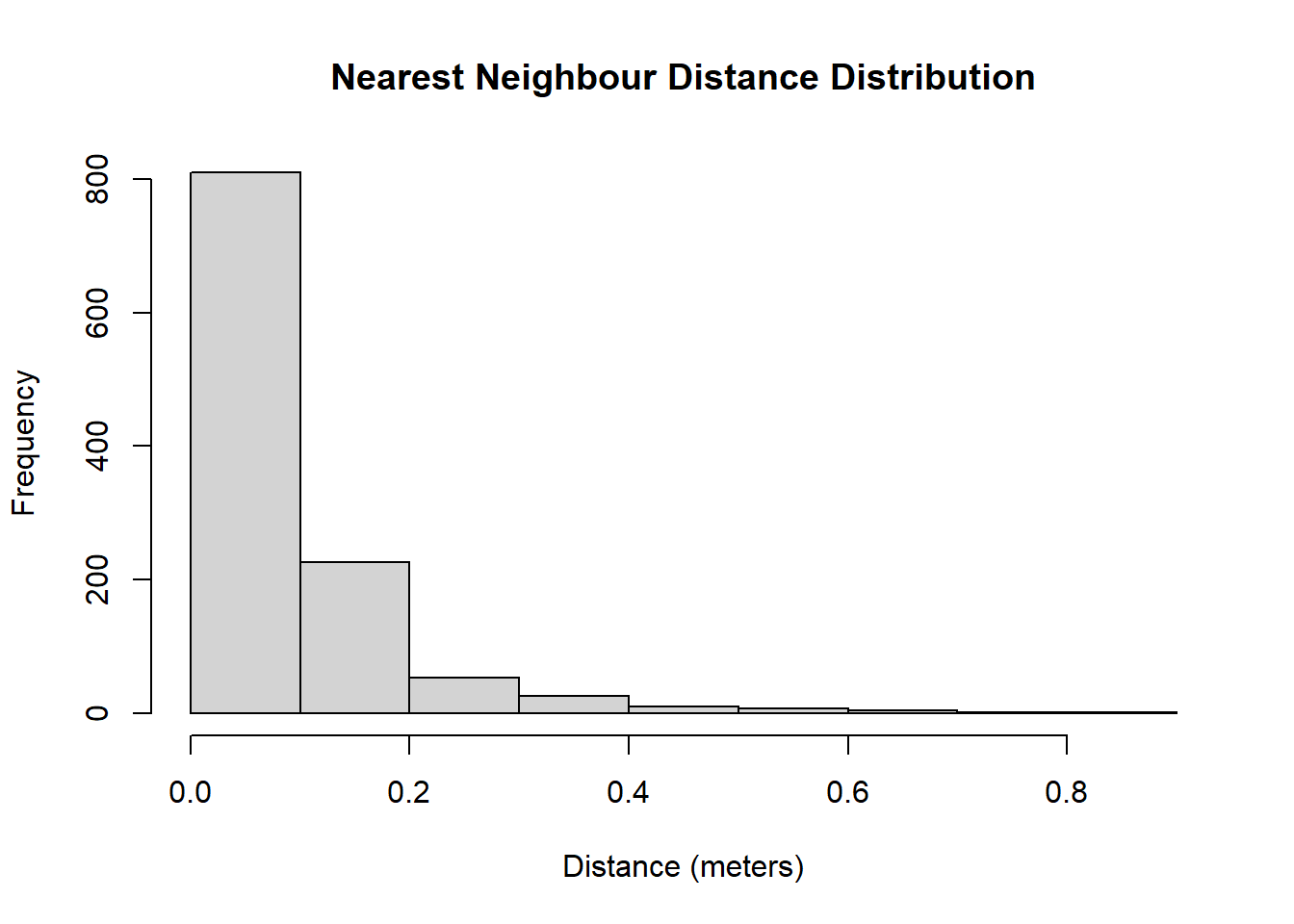
Figure 9.1: The shots are not scared of their neighbours!
Figure 9.1 tells us that the distribution of nearest neighbour distances is highly skewed to the right. This implies that the majority of the shots have a neighbour nearby. In fact, \(\frac{809 + 227}{1141} = 90.8\)% of the shots have a nearest neighbour that is located within 20 centimeters. The furthest nearest neighbour in our sample is 85.47 centimeters away.
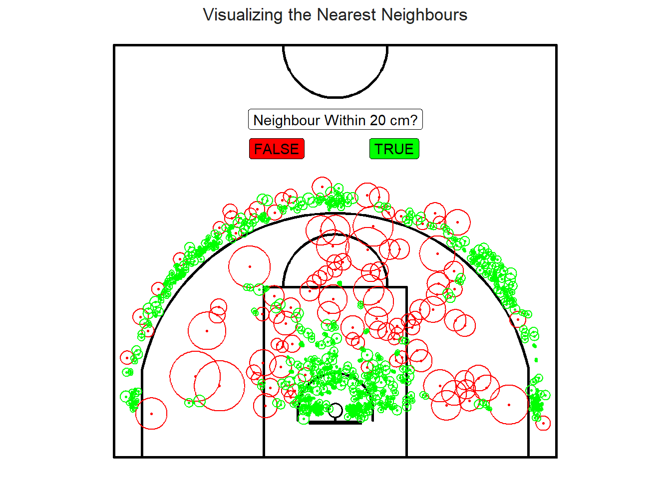
Figure 9.2: The mid-range loners
Figure 9.2 is an attempt to plot the nearest neighbour distances. Most of the lonely shots56 reside in the mid-range or on the outskirts of the three-point line.
9.1 G Function
We can calculate the overall probability of having a nearest neighbour within a specific distance using the Gest() function from the spatstat package.
# Calculate the Cumulative Nearest Neighbour Distribution for all distances
G <- Gest(shots_ppp, correction = "border")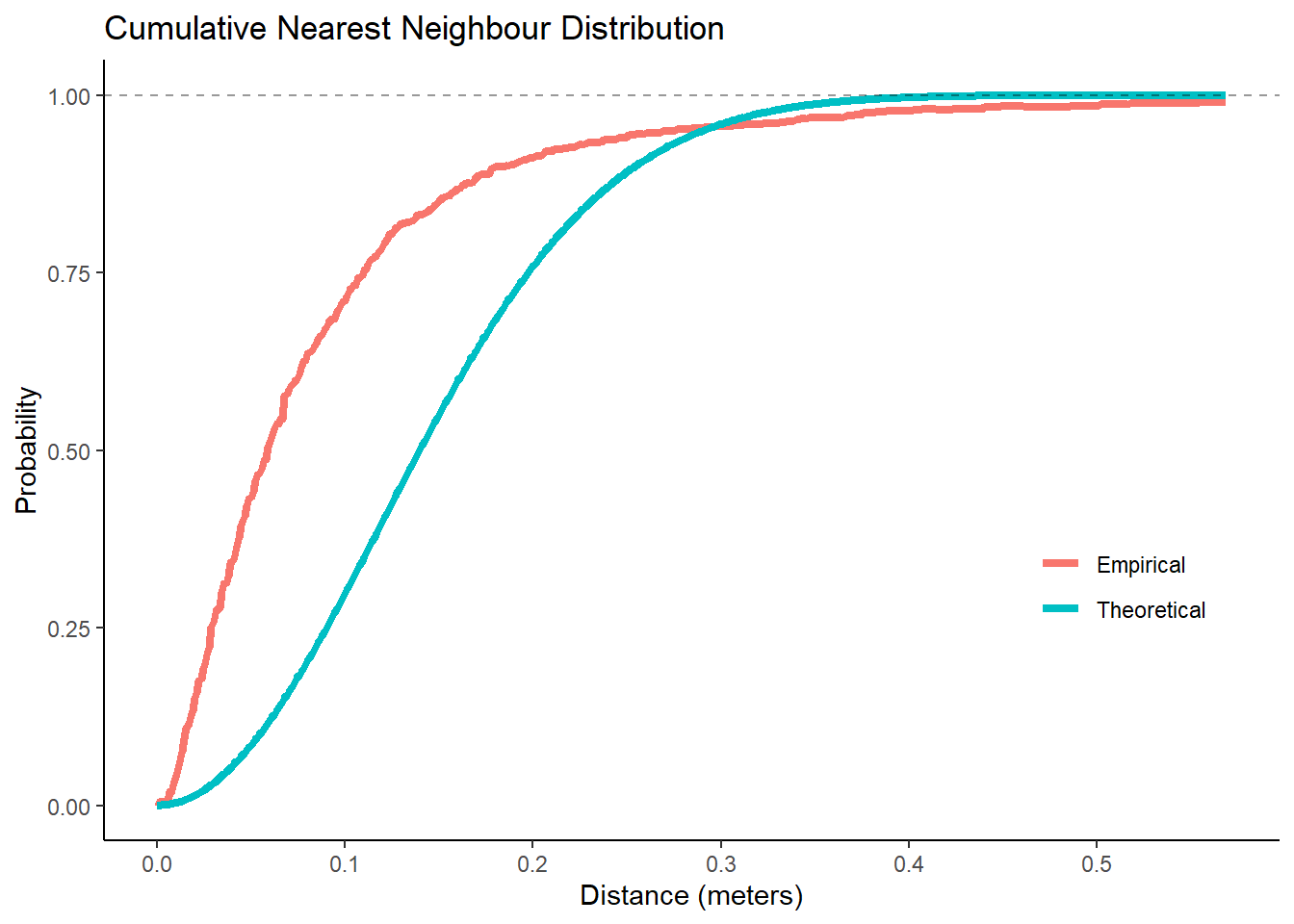
Figure 9.3: Higher probability than expected for short distances
The theoretical cumulative distribution of nearest neighbours57 is given by \(P(D < r) = 1 - e^{-\lambda\pi r^2}\), where \(\lambda\) is the intensity of our point pattern of \(\frac{1141 ~ \mbox{shots}}{100.78 ~ m^2} \approx 11.3 \frac{\mbox{shots}}{m^2}\). The fact that the empirical G58 increases more rapidly at short distances is evidence for clustering. It also makes sense that the empirical probability of having a nearest neighbour within 0.5 meters is close to one given the skewness of the distribution and the max nearest neighbour distance being 85.47 centimeters.
We could simulate envelopes around the theoretical curve to test whether the empirical curve significantly differs. However, we will stick with the the interocular traumatic test59 for now given our results from the quadrat test and our general knowledge that basketball shots depart from complete spatial randomness (CSR). It is pretty clear that red curve is far from the blue curve.
9.2 Ripley's K Function
The official name of the K function is Ripley's reduced second moment function. \(K(r)\) is calculated by calculating the average number of neighbouring points within a radius of \(r\) meters of each shot. The Kest() function from the spatstat package allows us to repeat this process for all relevant values of \(r\).
Note that \(\lambda \cdot K(r)\) is the average number of basketball shots to be found within a given distance \(r\) from a random shot60. Additionally, we kow that \(K(r) = \pi r^2\) for a completely random Poisson point process61.
K <- Kest(shots_ppp, correction = "border")Let's consider \(K(1)\) as an example. We can calculate it by counting the number of neighbours within a radius of 1 meter of each shot and then taking the average. It turns out that \(K(1) = 7.1 ~ m^2\) for our sample. Thus, the average observed number of points within a 1 meter radius of a random point was \(11.3 \frac{\mbox{shots}}{m^2} \cdot 7.1 ~ m^2 \approx 80\) shots. If the shots were random, then we would expect \(11.3 \frac{\mbox{shots}}{m^2} \cdot \pi ~ m^2 \approx 36\) shots within a one meter radius of a random point. These numbers are represented by the dashed line in Figure 9.4 below.
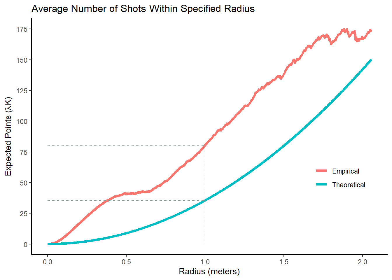
Figure 9.4: More shots than expected for any given distance
If the red line is above the blue line, then that means that there were more shots than expected62 for that specific distance. In our case, the observed \(K\) is greater than the theoretical one for any given radius. Subsequently, we conclude that our shot locations are clustered. If the red line was below the blue line, then this would be evidence that the shot locations are dispersed. Again, Monte-Carlo simulation could be used to calculate a p-value, but just looking at the curves is good enough for now.
9.3 Limitation
A big limitation of this type of analysis is that we know the shots appear to be clustered, but we don't know where those clusters are. Even the untrained eye can look at a shot chart (Figure 8.1) and intuitively draw circles around the denser areas. The next chapter will explore how we can visualize and quantify the clusters.
Note that all the R code used in this book is accessible on GitHub.